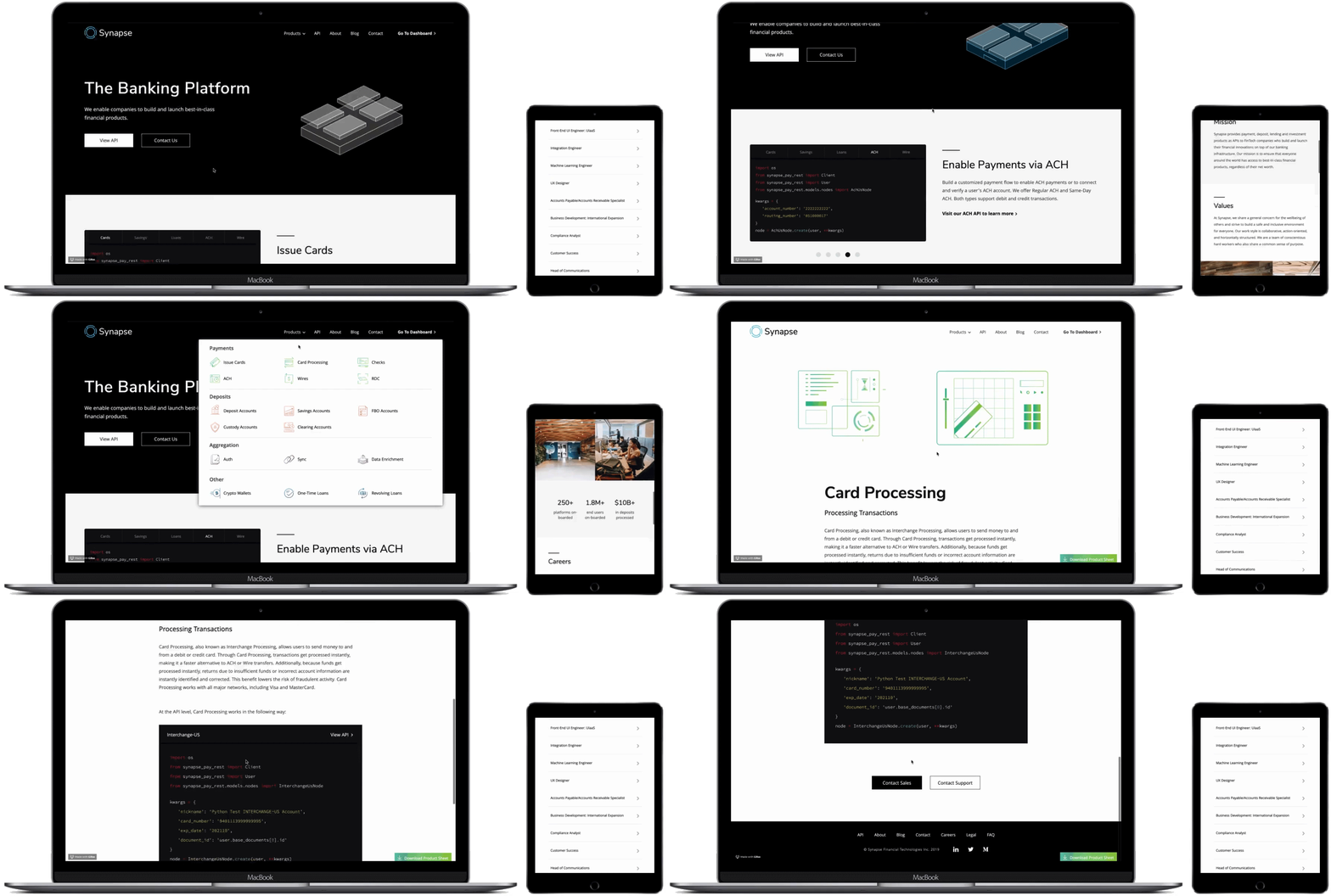
Synapse Website
The Company
Synapse is B2B startup that provides payment, deposit, lending, and investment banking products via its API infrastructure. Our clients consist of other financial technology companies in need of easy access to intuitive banking services.
The Challenge
My role as a User Experience Designer was to lead the effort to improve the usability of the company website. In addition to making the website more user-friendly, my goal was to rebrand it in a way that felt consistent with the banking industry and how we view ourselves within that space.
Team

Process
My design process was inspired by IDEO's user-centered methodology. During the user research and usability testing phases of the project, I worked together with the UX Researcher to identify the types of users most likely to visit our website and where they experience the most friction. I then explored solutions and validated them through another round of internal usability testing.

USMO Job Stories
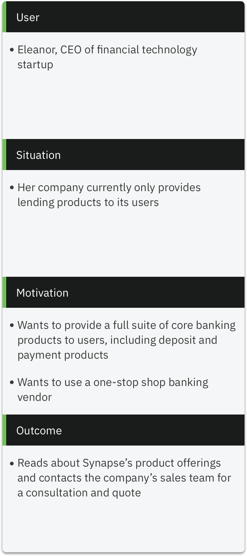
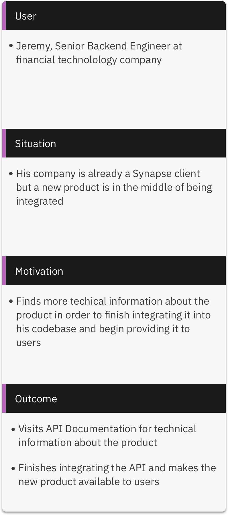
My first task was to start brainstorming what types of people are likely to browse the website. This exercise helped me put the website into context and begin looking at the product from our users' perspectives. I worked closely with the UX Researcher to create an USMO (User, Situation, Motivation, Outcome) chart, which is part of the Jobs To Be Done framework.
Persona
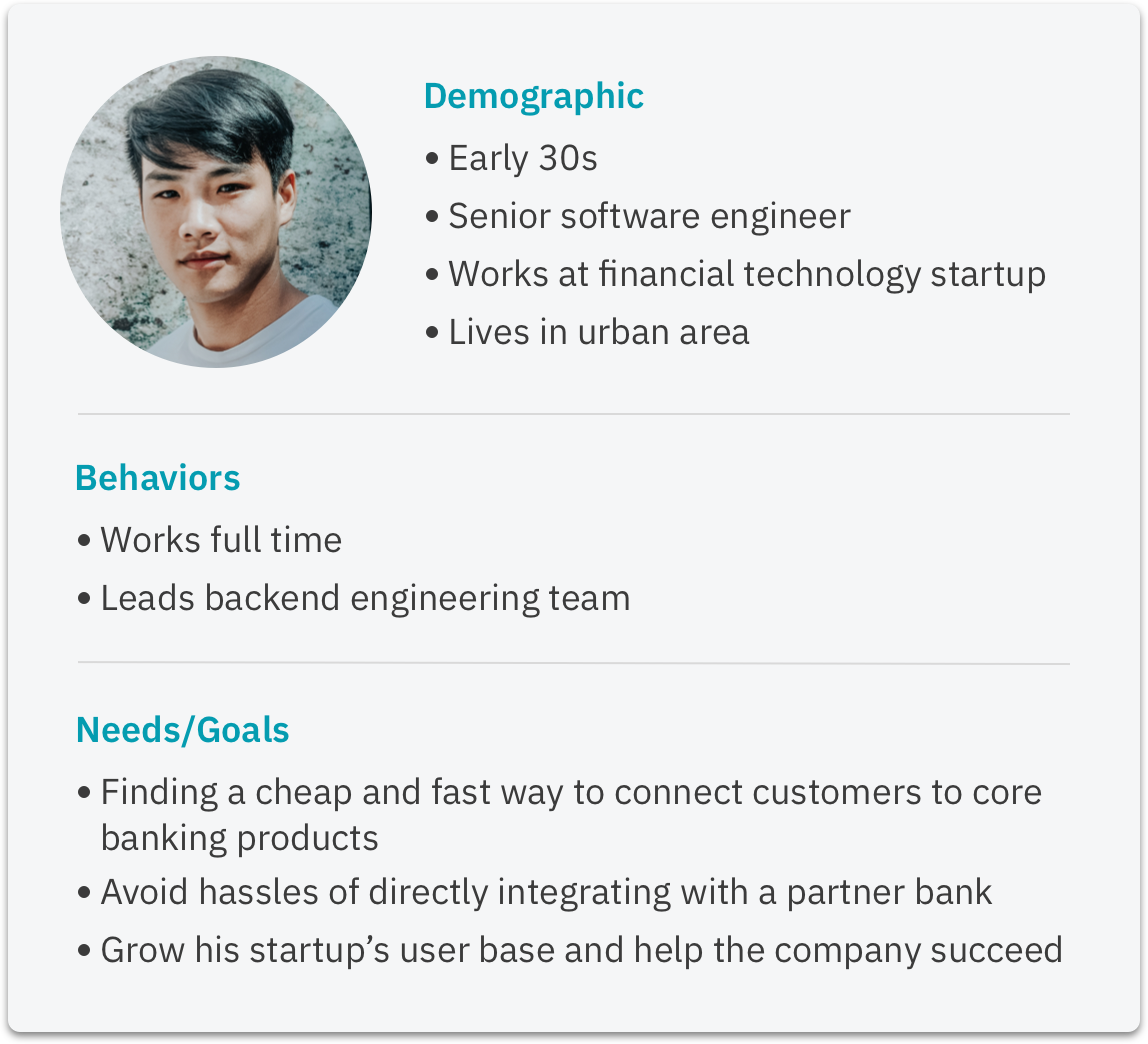
Following the USMO exercise, I created a persona to approximate the most common type of user visiting the website. To help inform it, I leveraged internal resources from our sales and customer success teams. This is a provisional persona that I updated whenever I gained new insights about our user base.
Pain Points
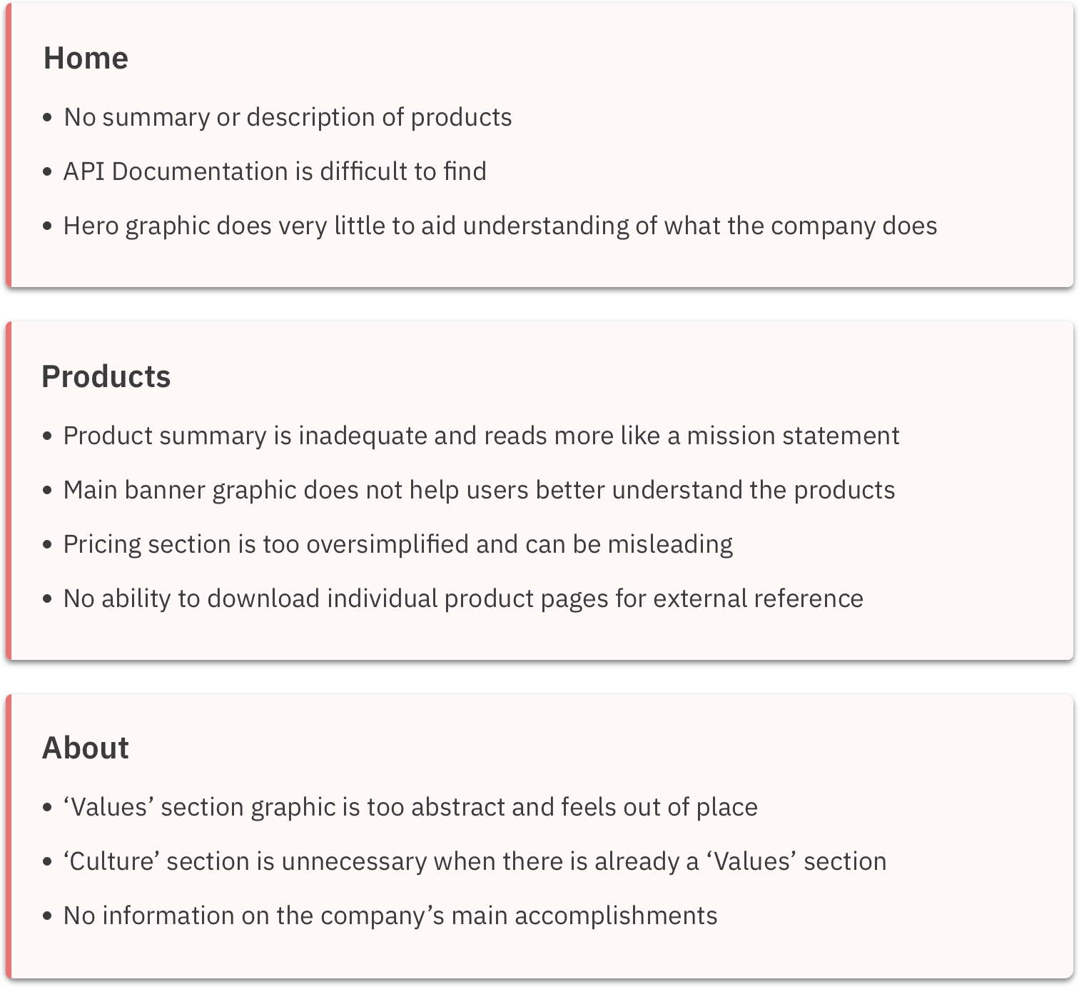
With a better understanding of what types of users visit the website, the team and I conducted in-house usability tests of the existing site in order to identify the most prominent pain points. Users were asked to perform basic actions like finding the API Documentation for Card Issuance and applying for a job. After collecting all usability insights, I decided to categorize the pain points by website page, starting with the Home page.
Lo-Fi Wireframes
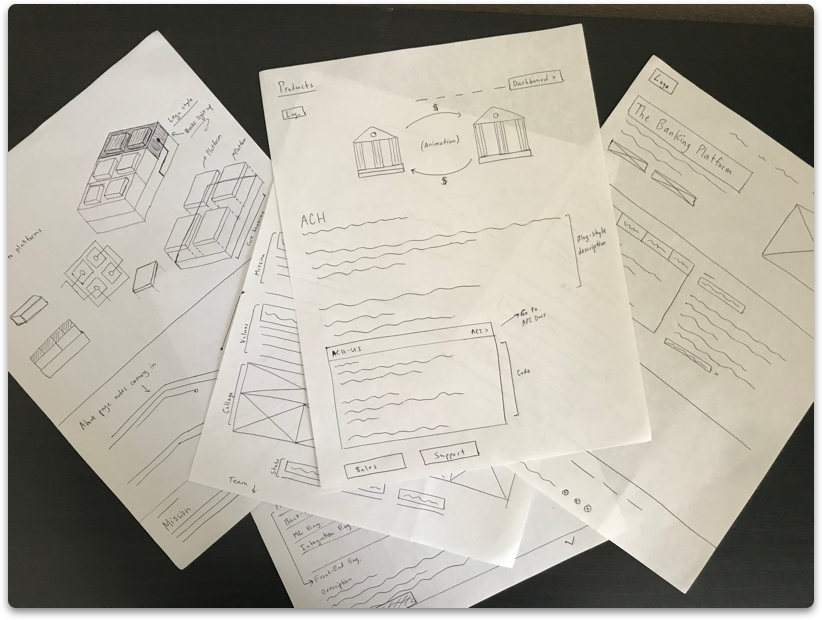
After identifying and prioritizing the most important pain points, I put pen to paper and began sketching out a few possible solutions to share with the rest of the team.
Hi-Fi - Homepage
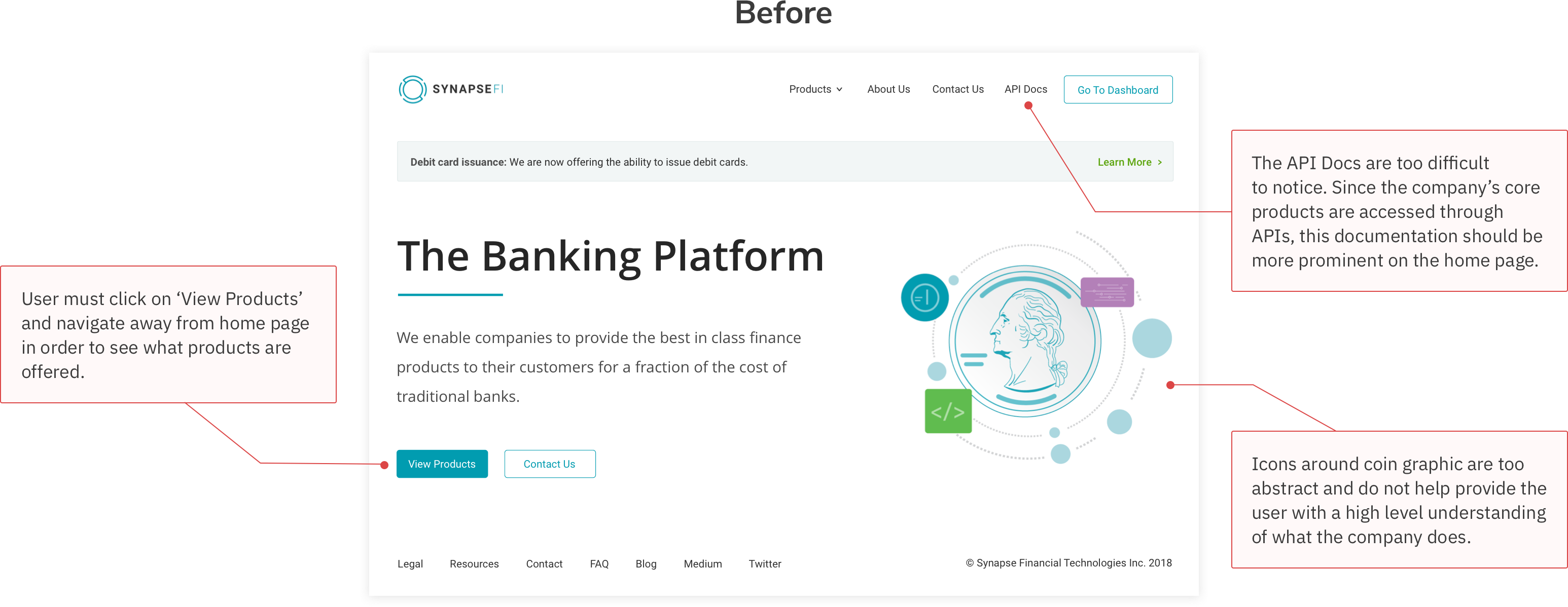
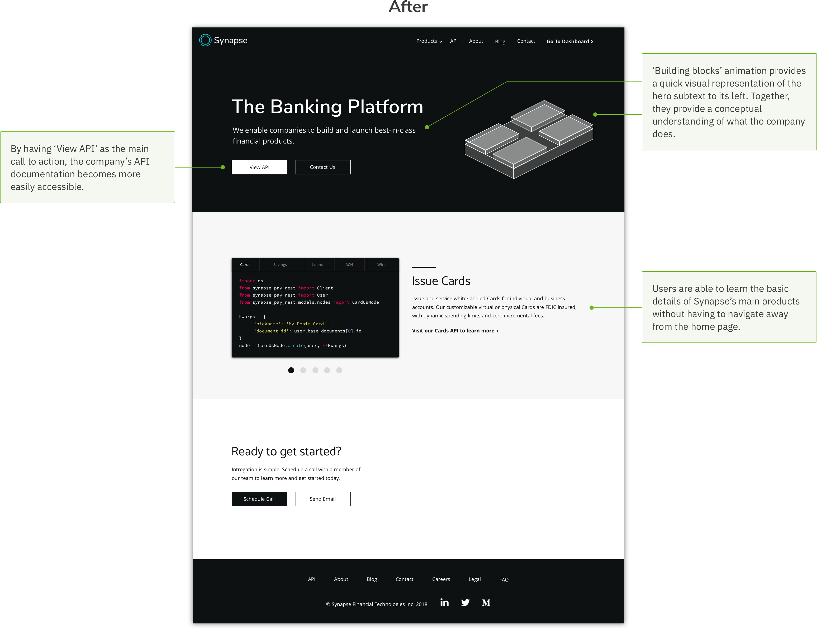
After discussing the wireframes with the team and CEO, I dove into the high fidelity phase of the design process. Here is a comparison of the home page before and after my redesign:
Hi-Fi - Product Page
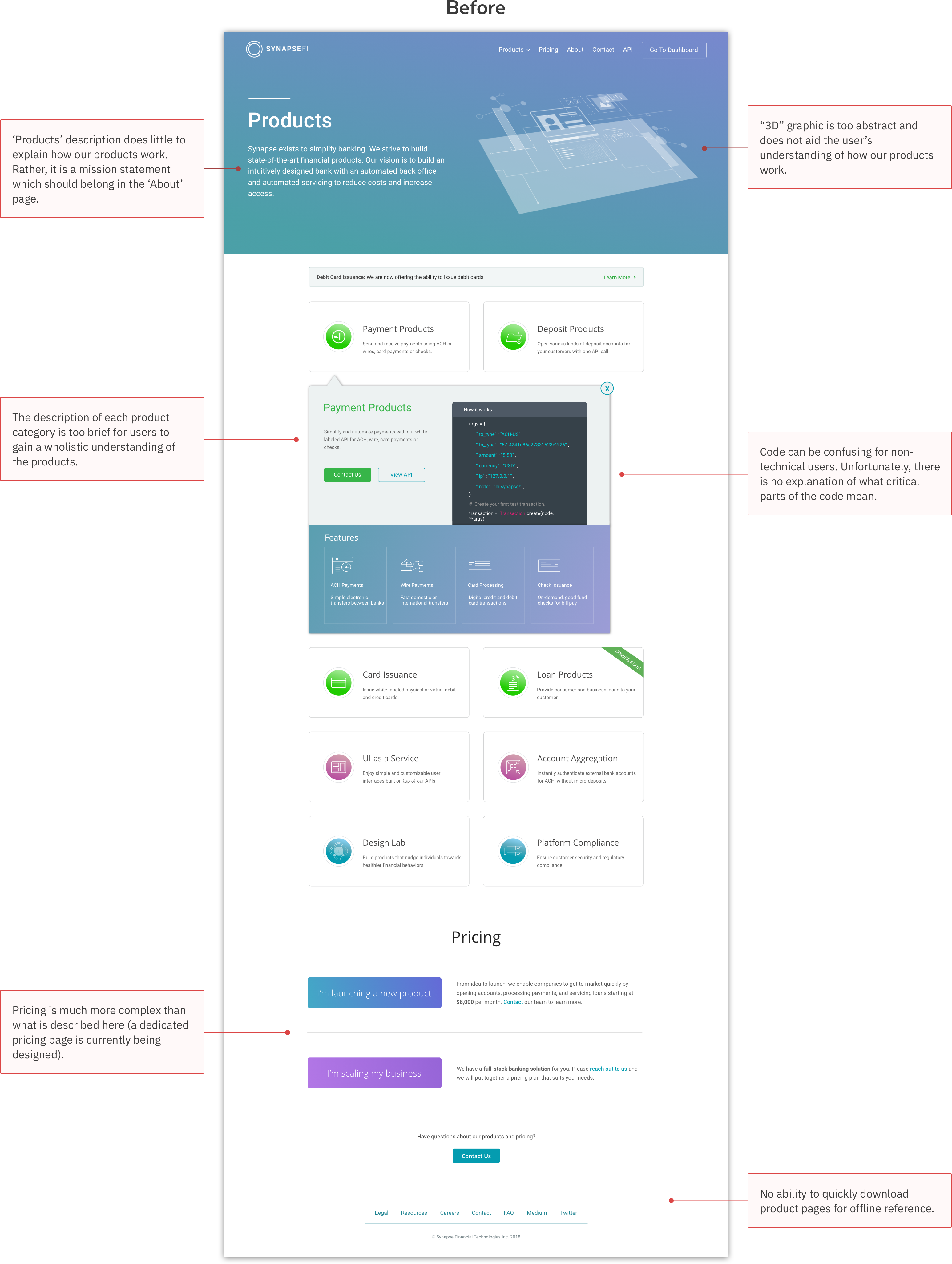
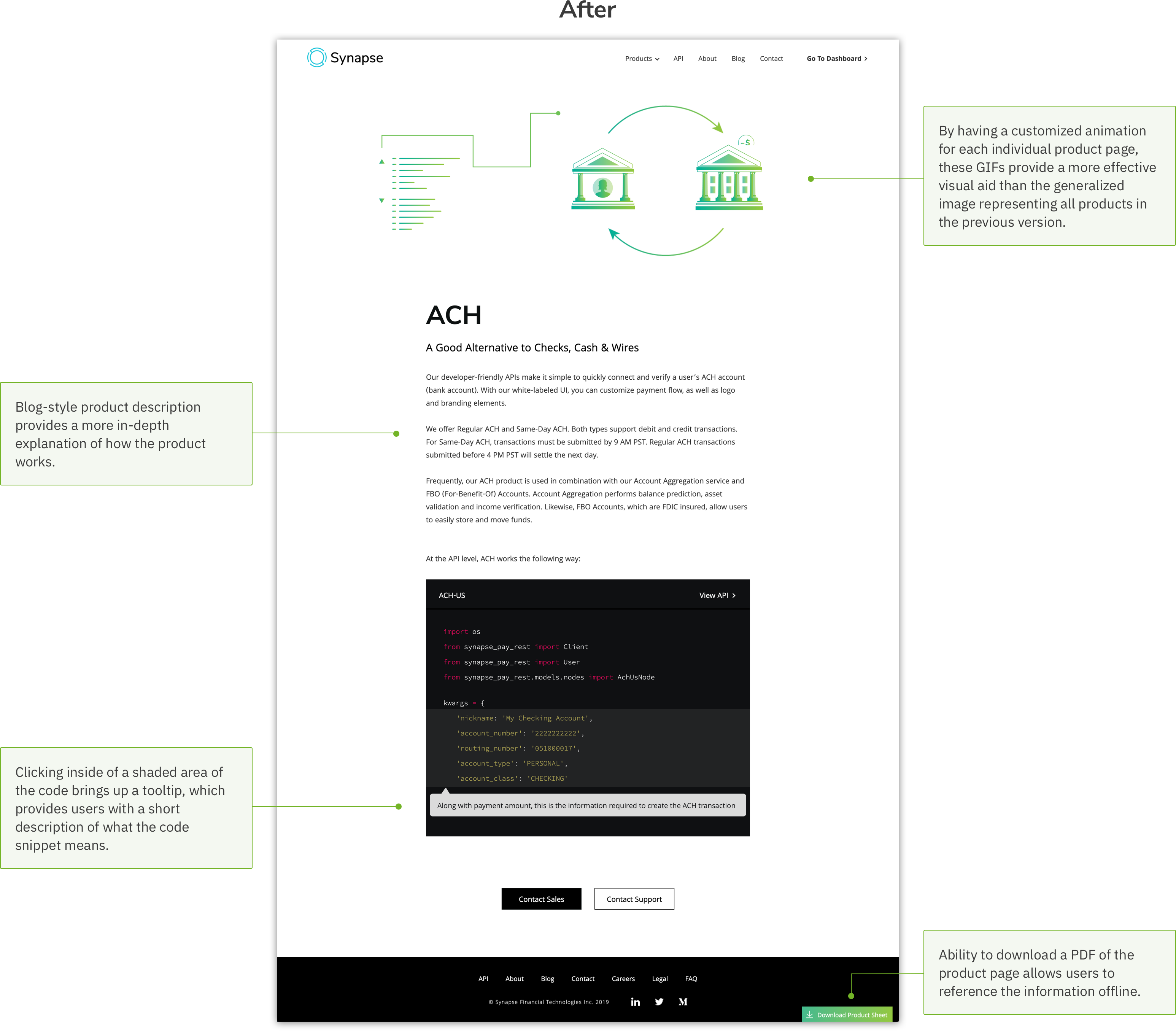
Comparison of the 'Product' page before and after my redesign:
Hi-Fi - About Page
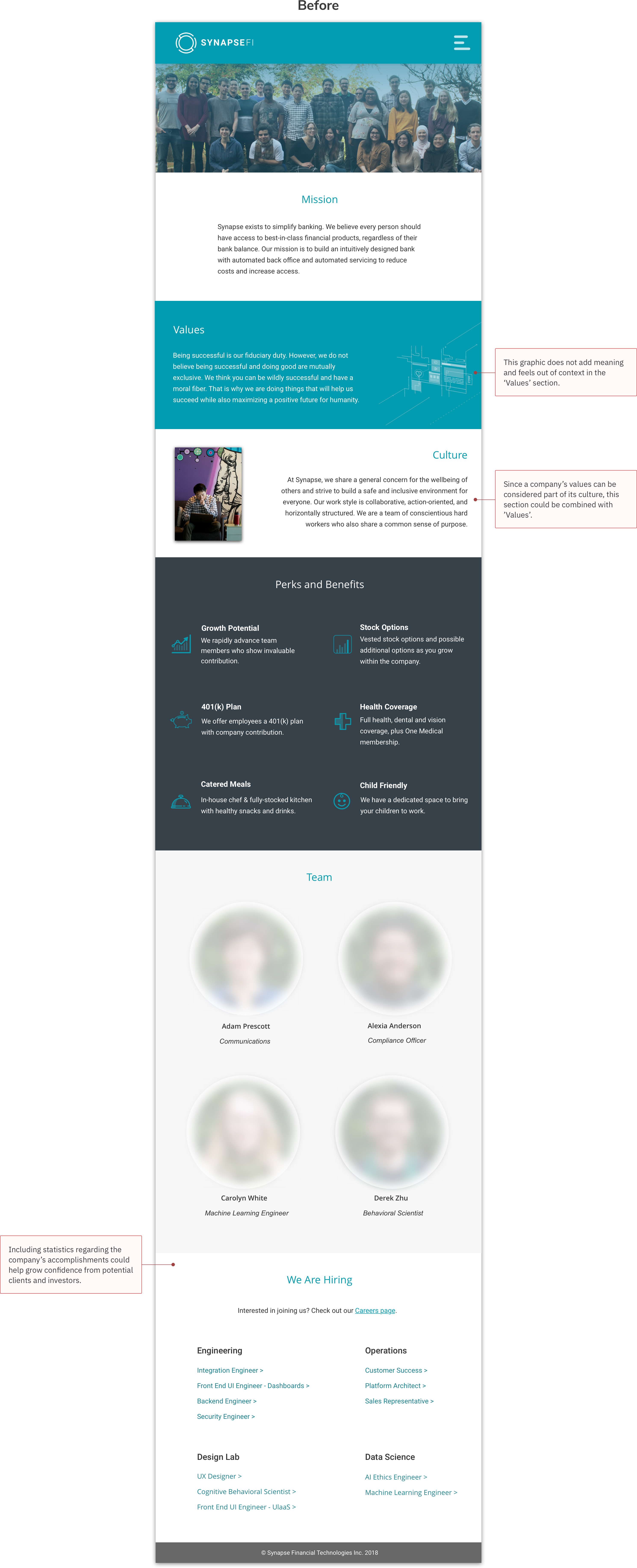
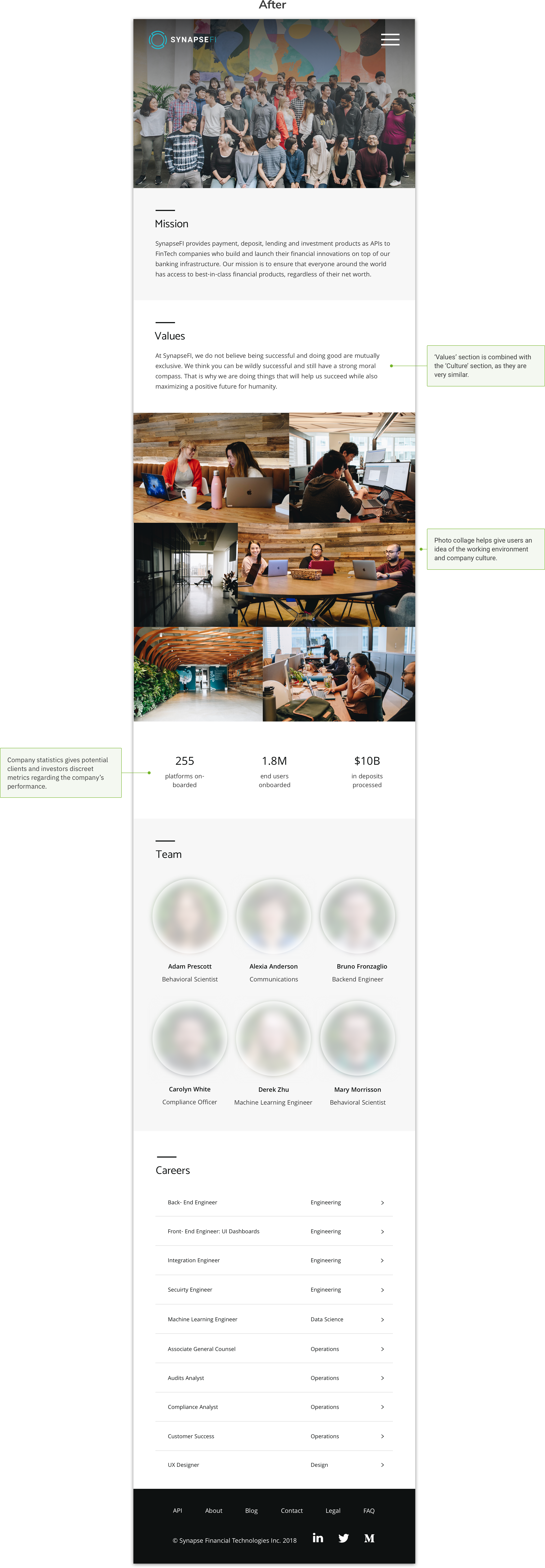
Comparison of the 'About' page before and after my redesign:
Next Steps
As the design of the website is an evolving, on-going process, the next objective for my team and I will be to continue to validate these designs through user testing. Also, we are working on a new addition to the website which we hope will make our sales process more transparent and streamlined. This page will be updated once these features are pushed live.