Atlas
The Company
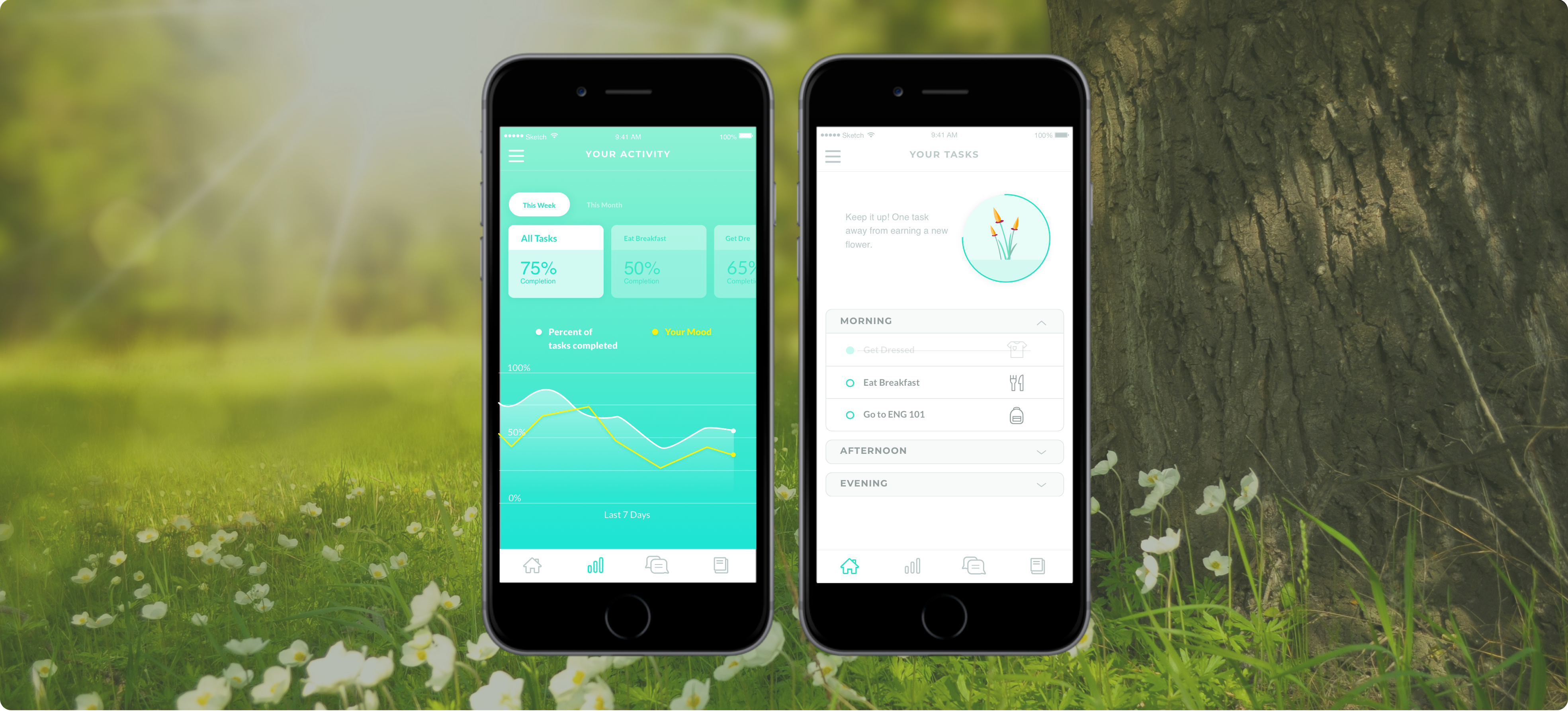
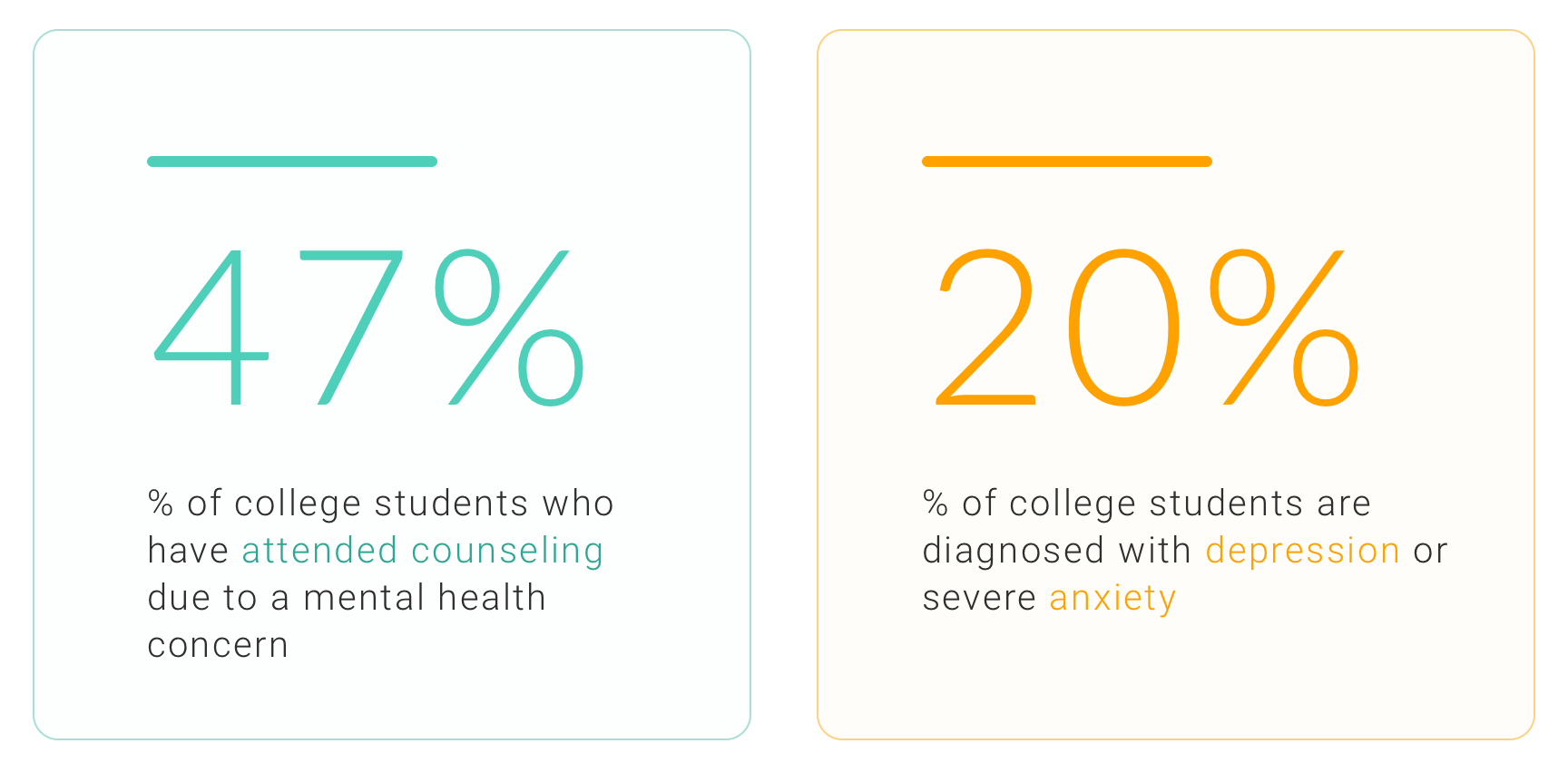
In the midst of rising expectations and the pressure to succeed, depression amongst college students is a growing issue. Atlas
is an iOS app I designed to help clinically depressed college students manage their mental
health.
Atlas is centered around Cognitive Behavioral Therapy (CBT), one of the most common forms of treatment for depression. This strategy aims to identify activities associated with negative thought patterns and re-evaluate them in light of reality. With Atlas, the student works with
their therapist to identify these difficult tasks and strives to accomplish them through the support of friends and family.
The Problem

Based on initial interviews with patients and therapists, I identified two interrelated problems. First, students are very busy
and therapists see a lot of patients, so it can often take weeks for a new therapy session to get scheduled. My team and I needed to think
of a way to help bridge the gap between patient and therapist.
The second problem stemmed from the first. Therapists need more
data to provide value to their patients, especially when they are not physically present.
My Role
- Worked with another designer through all stages of the design process
- Conducted a design studio to brainstorm and develop initial UI sketches
- Led a branding principles workshop with the client and design team
- Contributed research and design deliverables at each stage of the project
Process
Depression and CBT Research
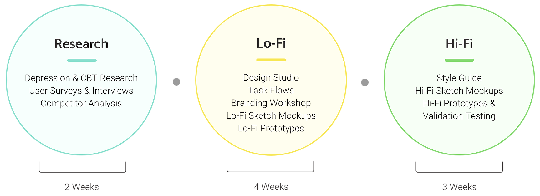
To get a better understanding of the space I was designing for, I conducted general research on depression, specifically amongst college
students. One resource I found to be particularly educational was Stanford Professor Robert
Sapolsky's presentation on depression in the U.S.
A large part of our research was focused on learning about
different types of coping mechanisms that exist for depression, including Cognitive Behavioral Therapy. CBT became the core form of treatment used in our app.
User Surveys and Interviews
My next step in the research phase was to put together an anonymous survey to collect information on how college students cope with their depression. In addition to the survey, I conducted phone interviews with a couple students
and therapists who were willing to share their thoughts and experiences surrounding depression.
One of the key questions I asked in the survey was
'How do you manage your depression?' This was a multiple choice question that strongly influenced the main treatment
strategies we chose to incorporate into the app's design.
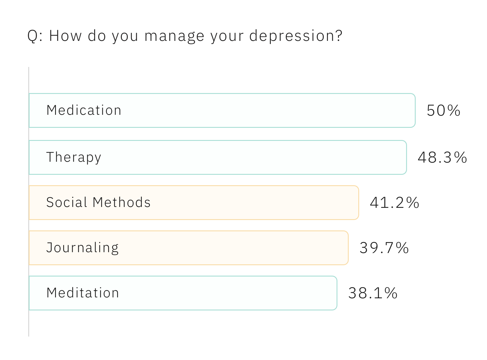
As shown above, the top two responses were 'Medication' and 'Therapy'. However, these forms of therapy were out of our control, since we were designing an app. We decided to focus on the responses in orange, which were 'Social Methods' and 'Journaling'.
Competitive Analysis
In order to gain a better understanding of the mental health app landscape and see how others are solving similar challenges, I decided to conduct a competitive analysis. The two main aspects I chose to focus on were coping mechanisms and branding strategies.
The results revealed that social methods, journaling, and mood-tracking were the three most popular types of treatment methods leveraged by the apps we looked at. I was pleased to see that all three strategies were consistent with our findings from the survey and interviews.

Persona
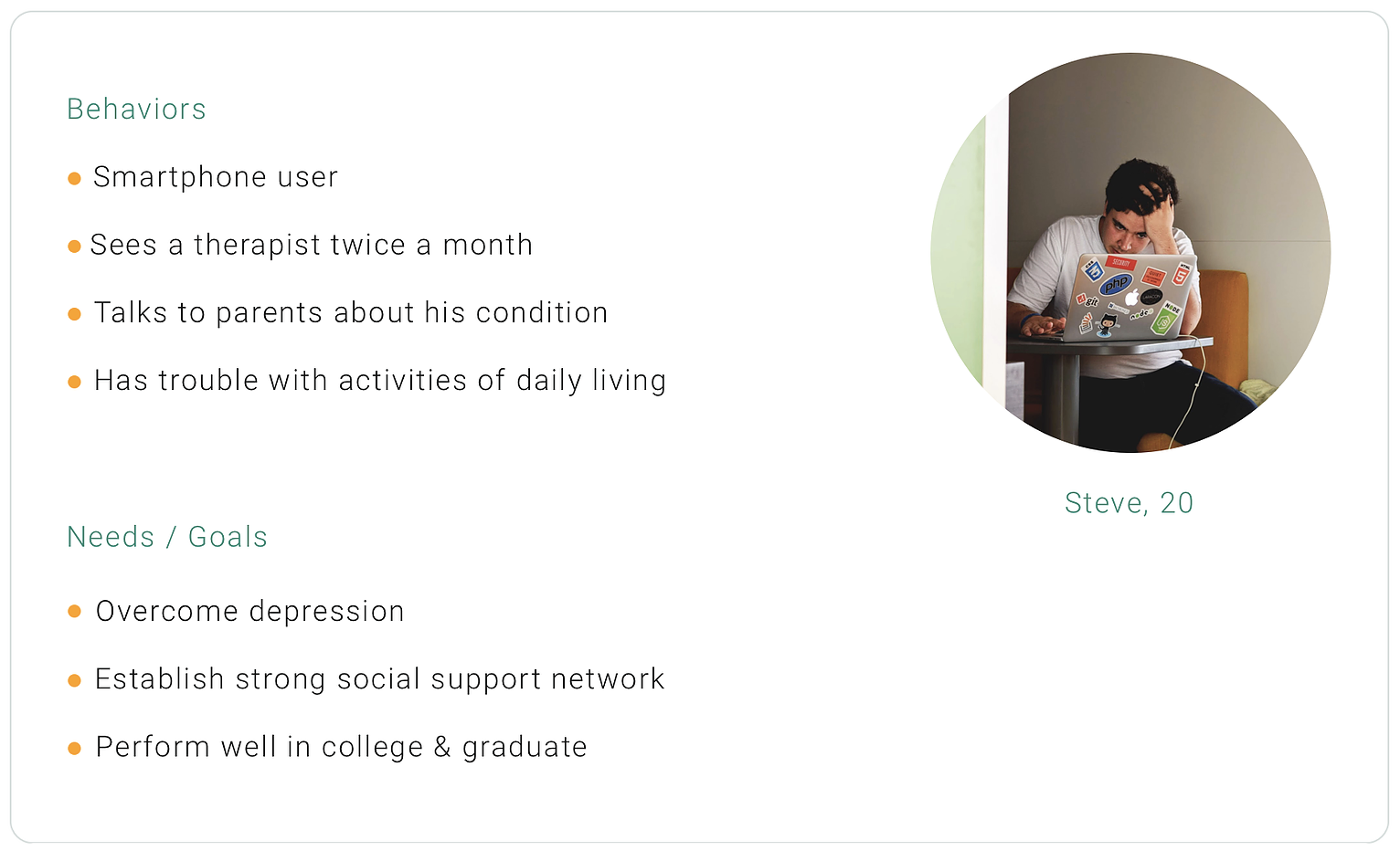
After aggregating all of our insights from the research phase (particularly the survey and interviews), I put together a provisional persona to help guide the rest of our design process.
Simplified User Flow
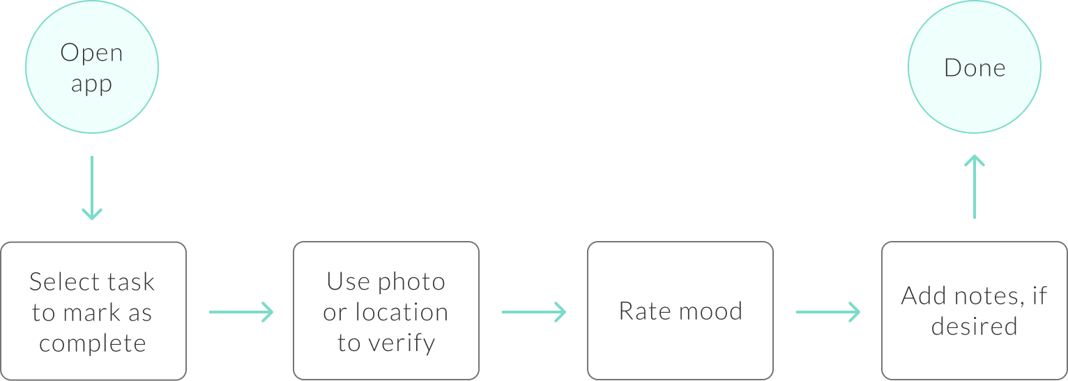
After synthesizing the insights from our research and identifying the core features we wanted to include in Atlas, I was ready to start putting together some user flows. Here is a simplified diagram highlighting the mood-tracking and journaling components.
Design Studio
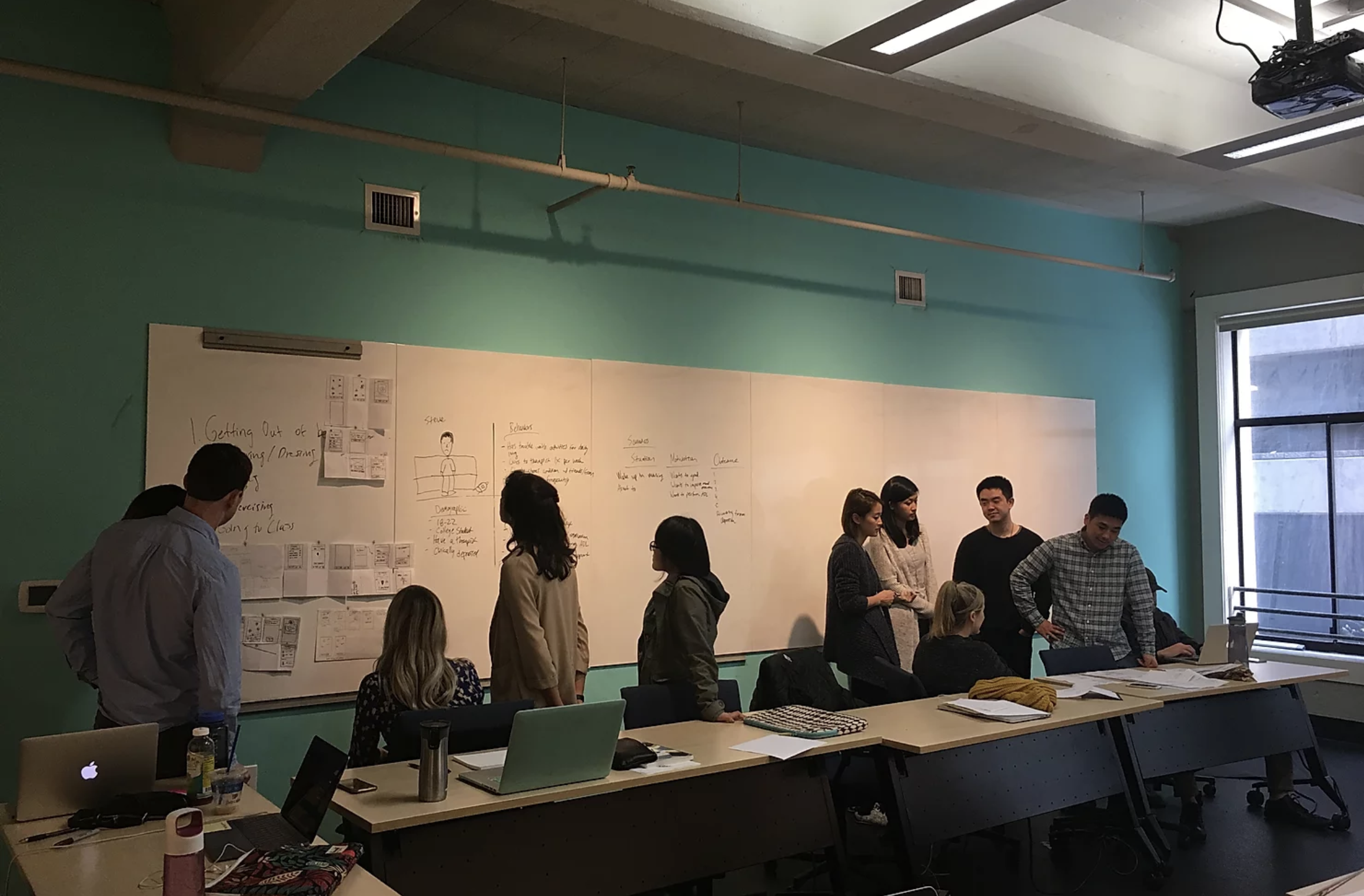
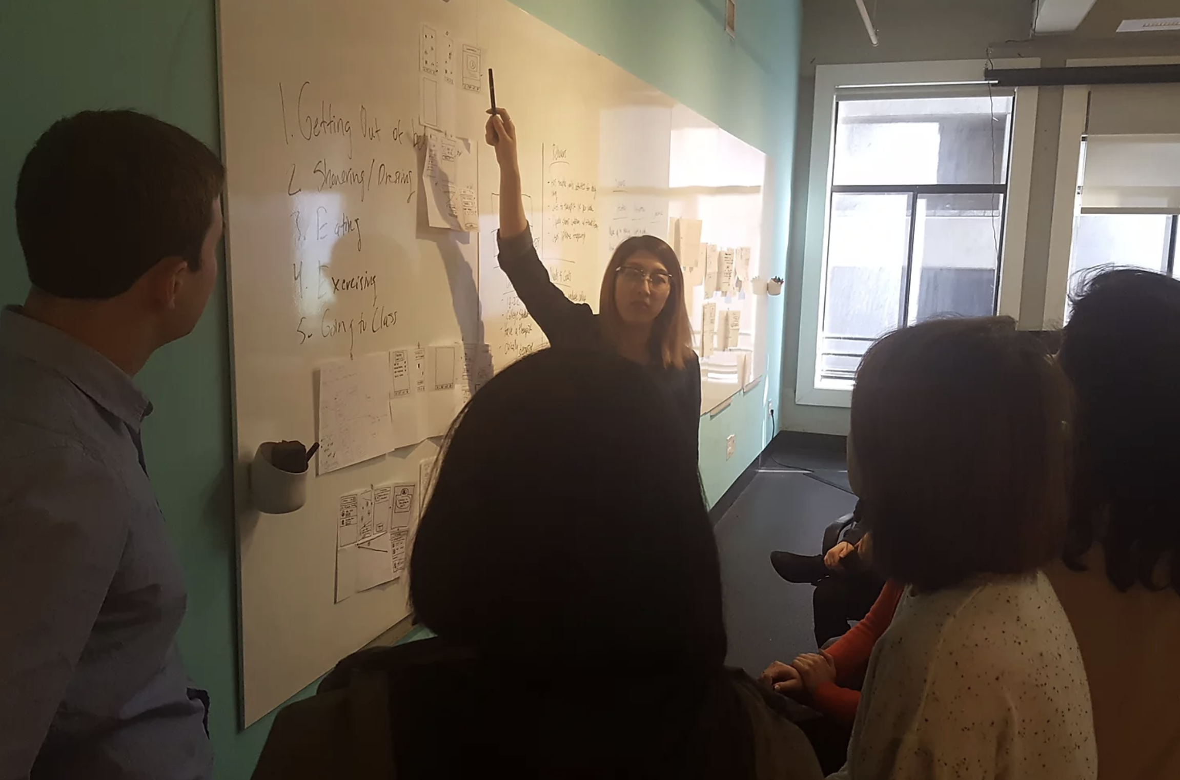
Next, my team and I decided to conduct a Lean UX Design Studio to perform rapid ideation around the social, journaling, and mood-tracking
core features.
Here's the team in action!
Branding Principles Workshop
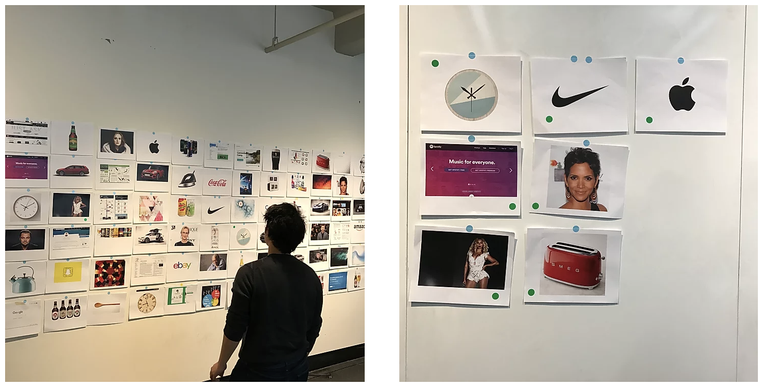
My next task was to begin defining the visual brand of Atlas. I started off the session by pinning up around 70 images on the wall and having the founder indicate whether or not he felt the images captured the personality of Atlas. I had him place green stickers on the images he liked and red stickers on those that didn't resonate with him:
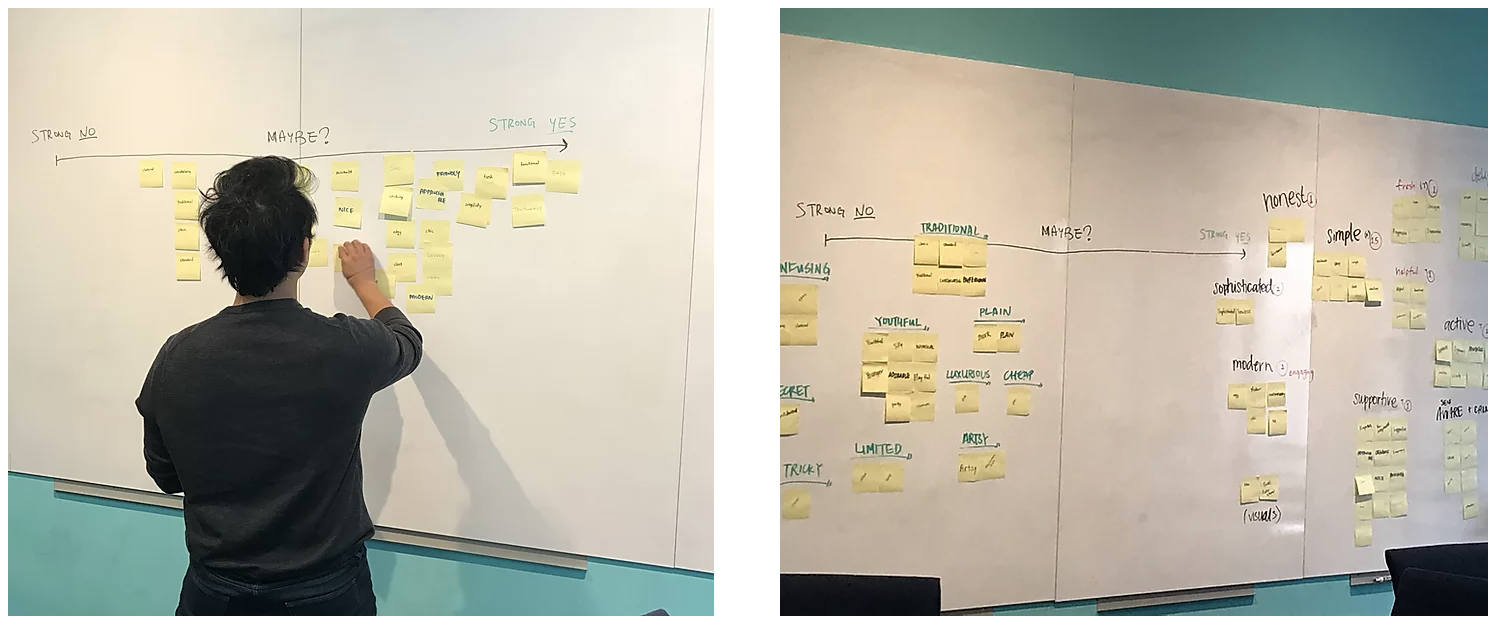
I then had the founder describe what he envisioned Atlas to look and feel like for users. Based on his description, I wrote down a list of adjectives on a set of sticky notes and had him place them along a spectrum of 'Strong No' to 'Strong Yes':
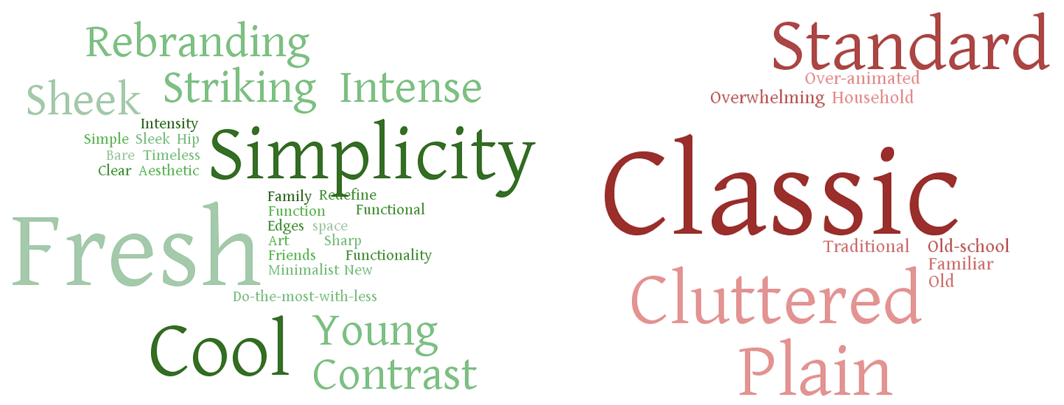
Here are the cleaned up results, in the form of 2 word clouds (Green = 'Yes' and Red = 'No'):
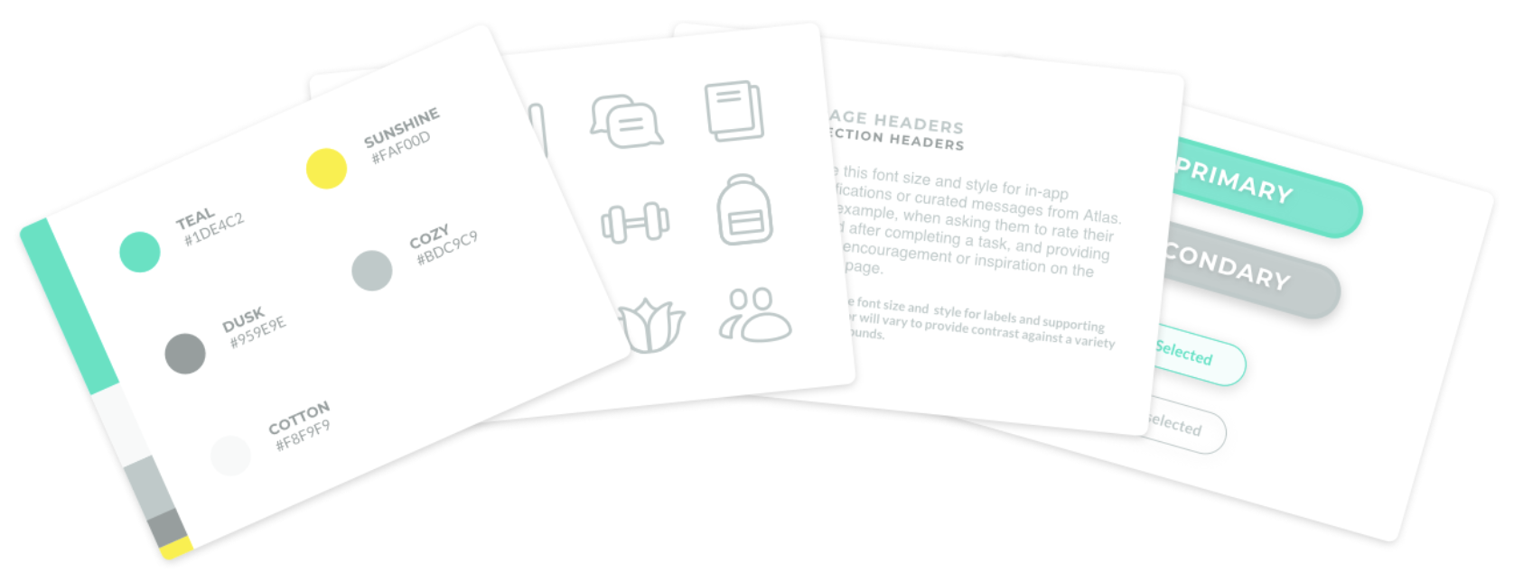
Style Guide
I put together a style guide based on information I gathered during the branding workshop. I was focused on a light, cheerful, and optimistic visual design for Atlas.
User Testing
Throughout Lo-Fi and Hi-Fi phases, I conducted several rounds of usability tests and interviews to gain a better understanding of both student and therapist needs. Here are the four main points of feedback I received:
Students
- Gamification could help motivate people more to use the app
- Confirming a task can be simplified
Therapists
- Need to protect the user's confidential information
- Weekly/monthly task completion averages would be useful data
I. Gamification
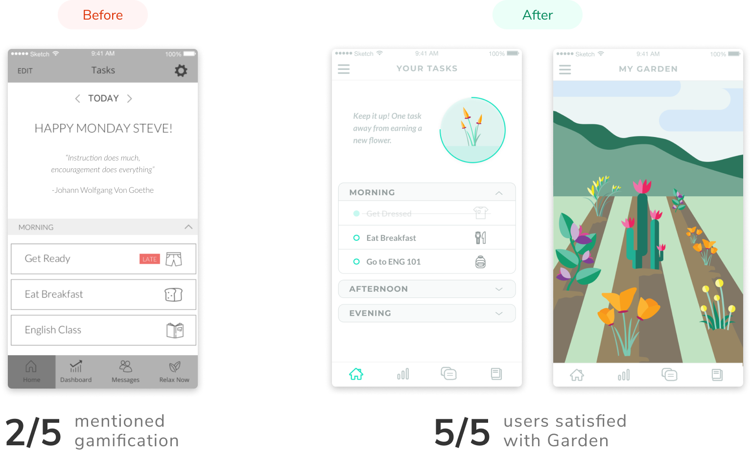
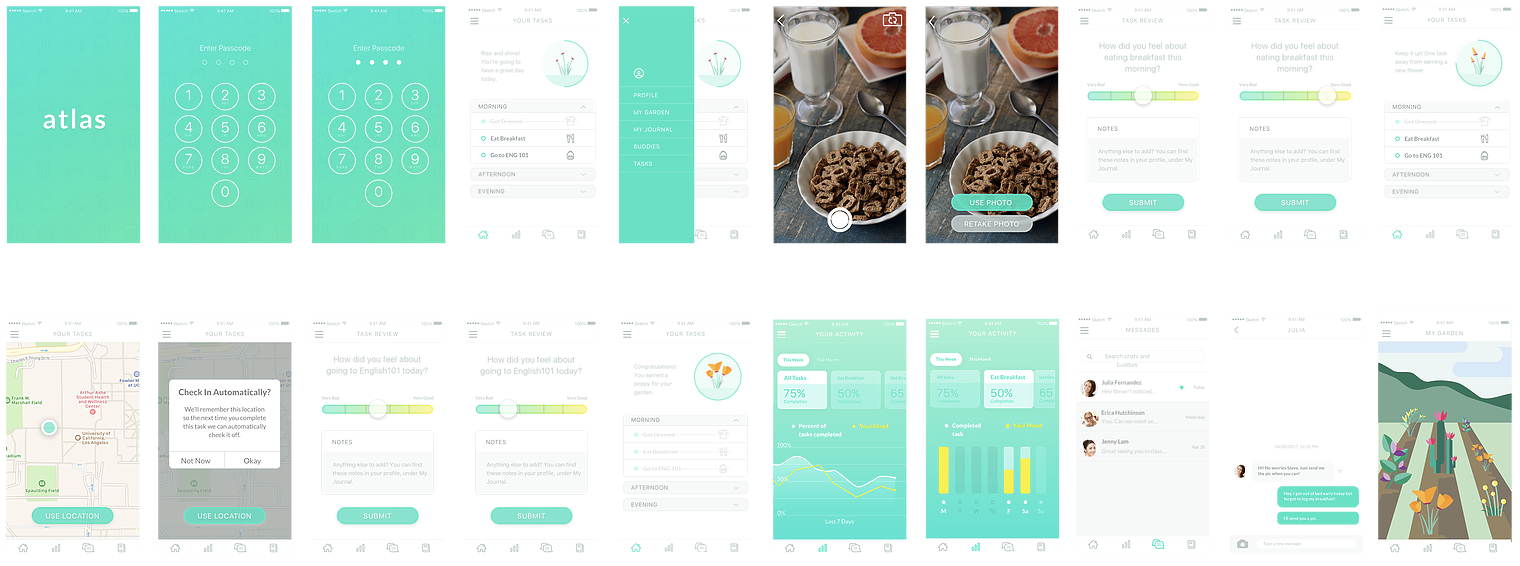
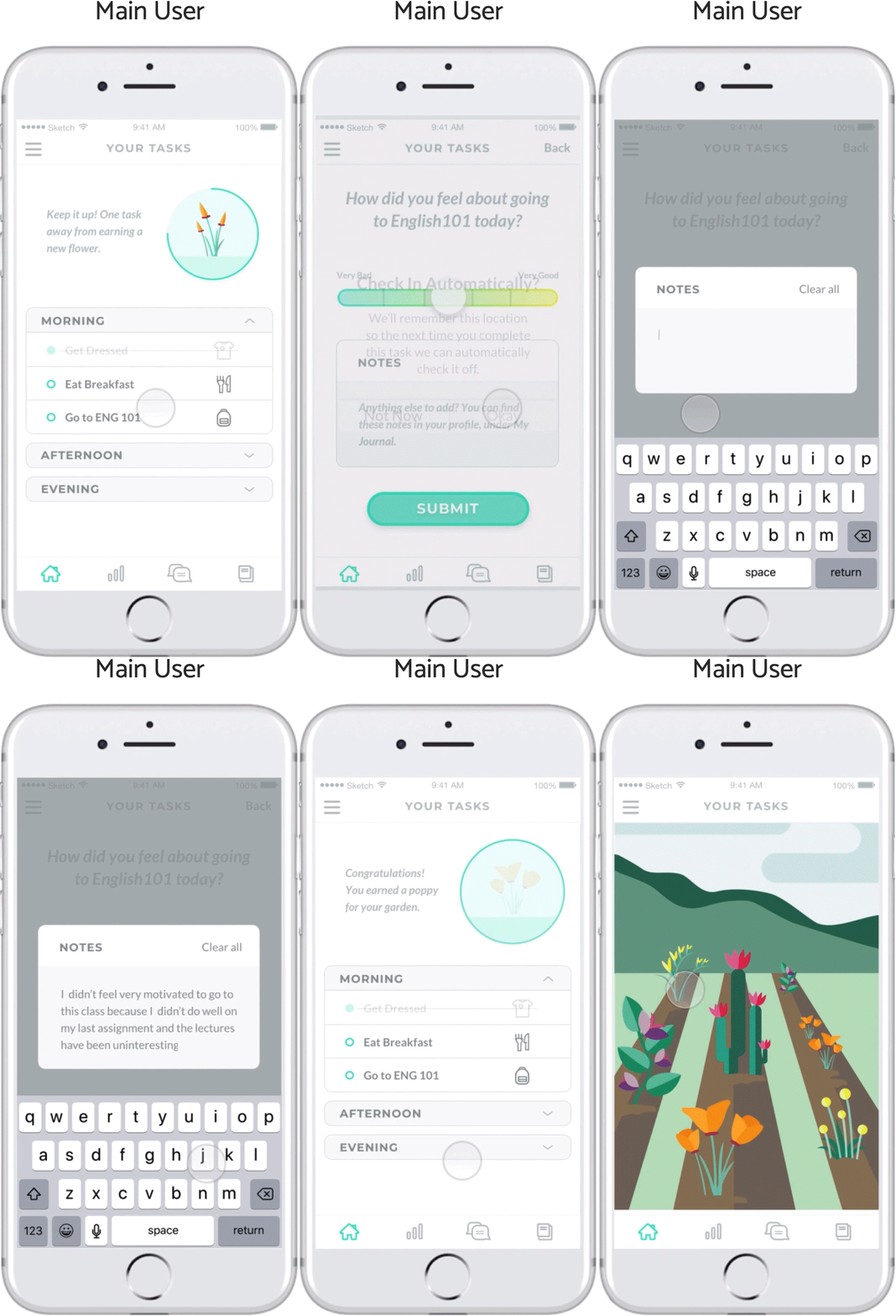
I decided to gamify Atlas by designing a flower that grows each time the user completes a task. When they finish all tasks for a given day, the flower gets added to their Garden, which can be accessed through the hamburger menu.
II. Confirming a Task
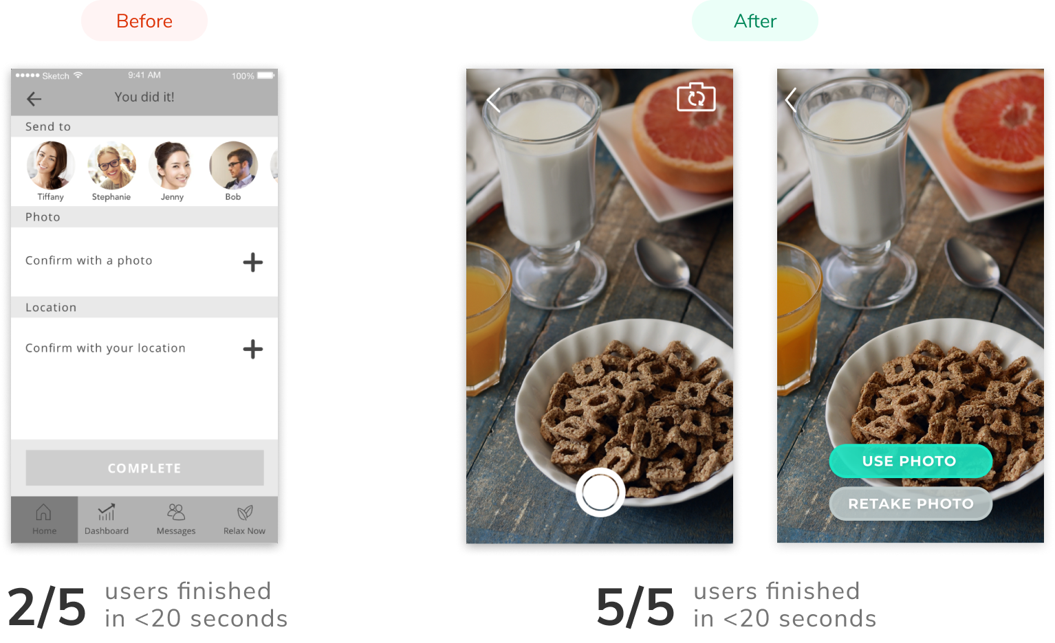
I timed users to see how long it took for them to confirm a completed a task. Initially, there was some extra cognitive load I placed on users by asking them to choose between photo and location confirmation. I removed this choice and automatically routed them to the most appropriate confirmation method.
III. Confidentiality
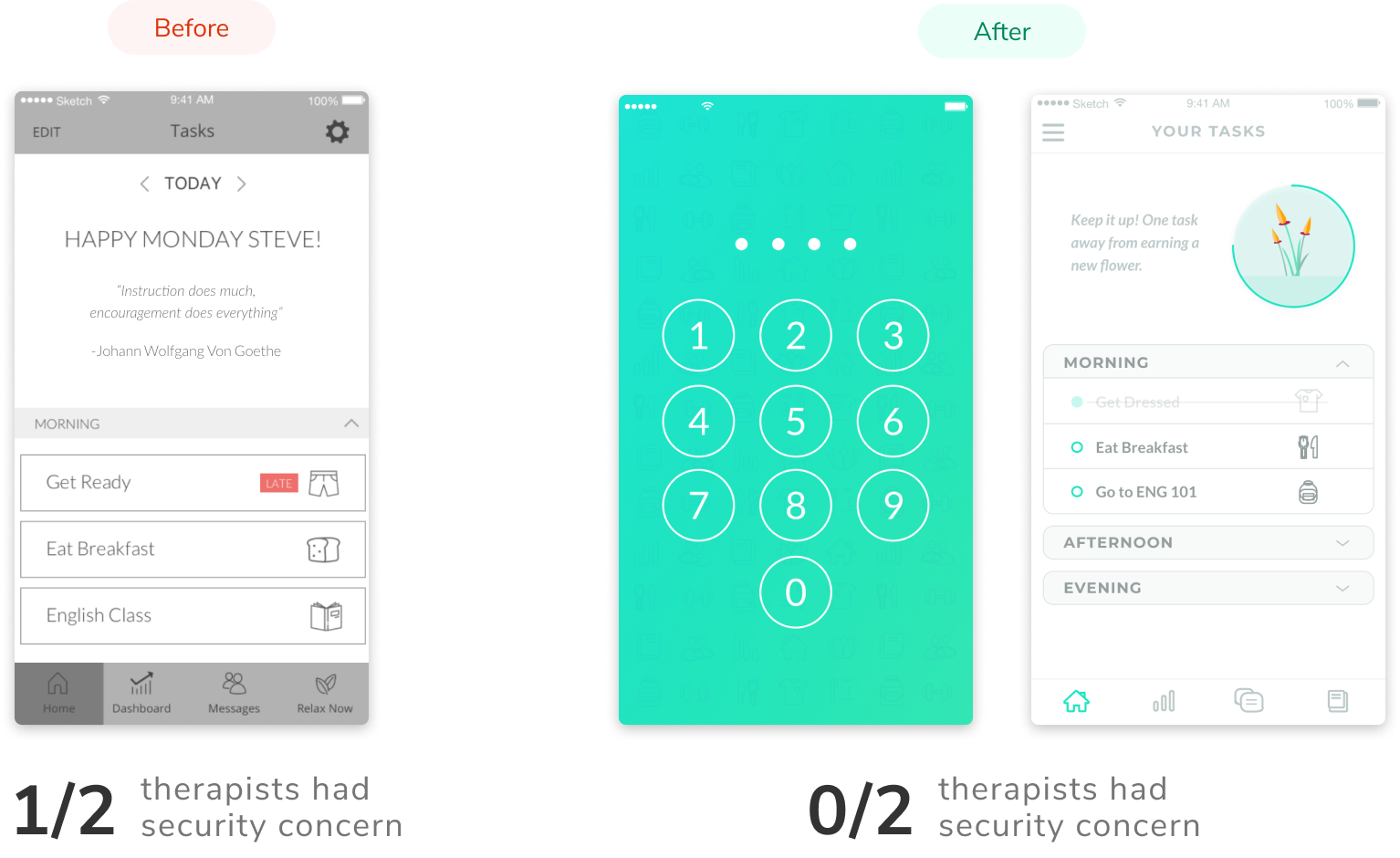
Confidentiality was an issue brought up by one of the therapists we spoke with. I decided to secure the user’s information by adding an iOS-style passcode screen to open the app.
IV. Task Completion Averages
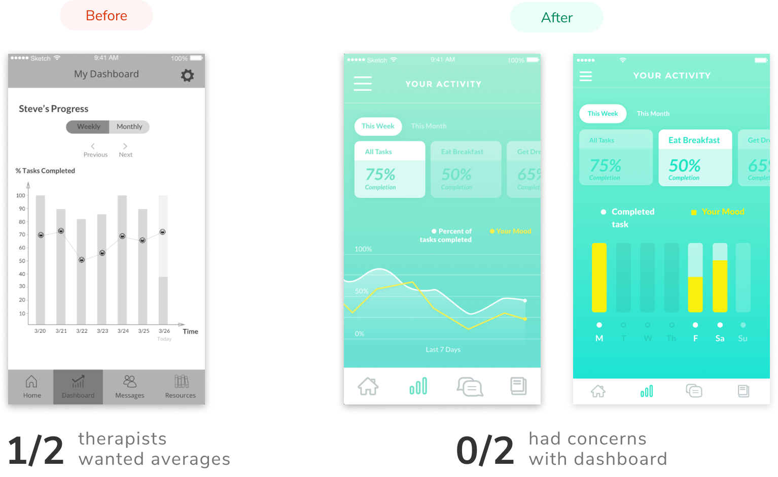
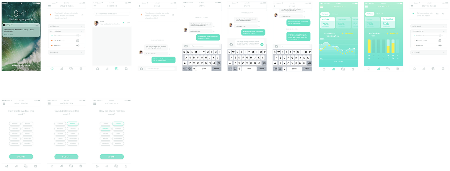
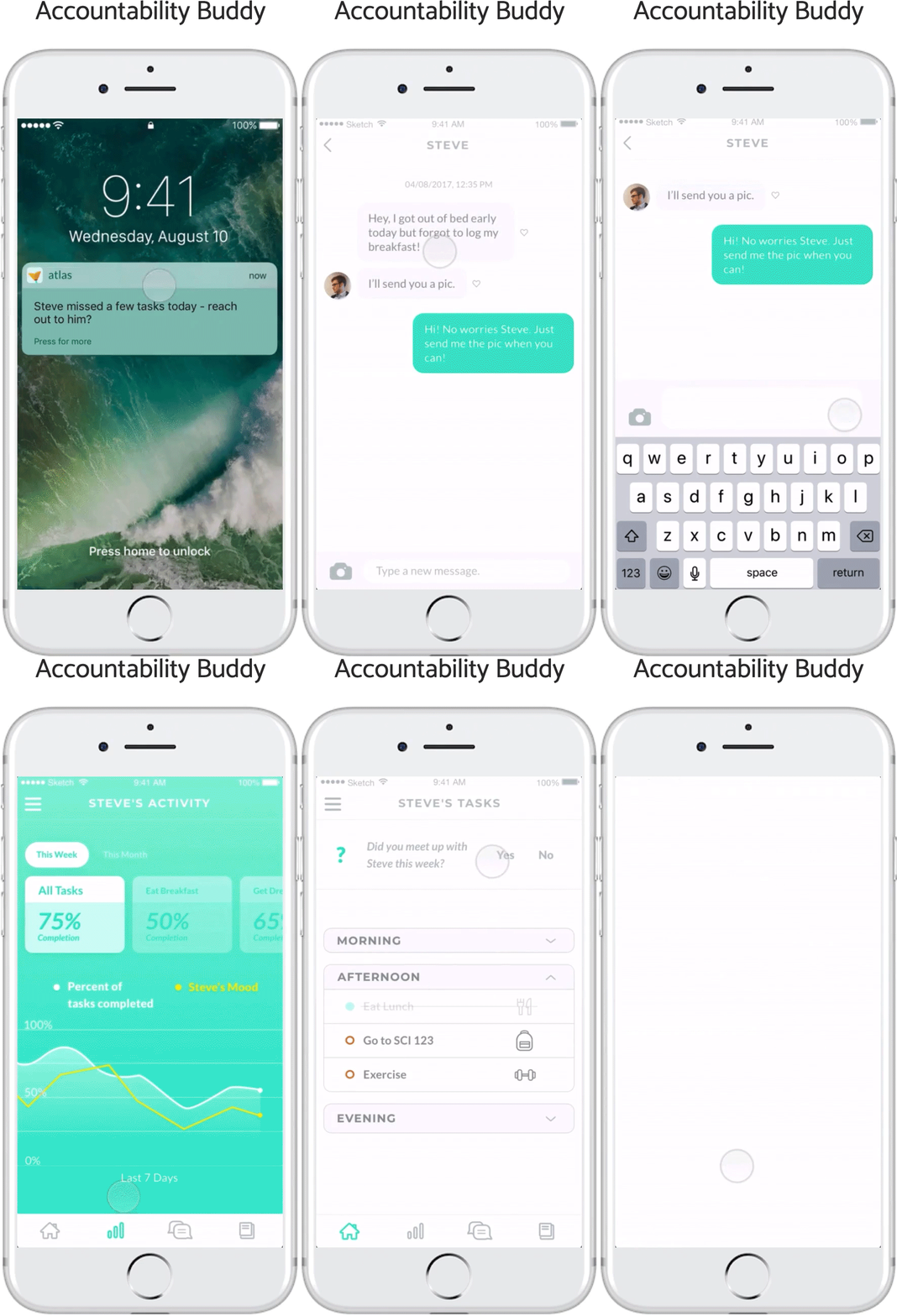
Lastly, since therapists would be using the app primarily for the data, it was interesting to hear their thoughts around what other types of information they’d find useful. They wanted to see weekly and monthly averages for task completion, so I decided to create a card system showing average completion per task and for all tasks over a given period of time.
Hi-Fi Mockups
Here are the final Hi-Fi mockups for the Main User and Accountability Buddy:
Main User
Accountability Buddy
Final Prototypes
Reflection
I am thrilled to have had the opportunity to fully design the first generation of Atlas. As I came to learn, mental
health is a very challenging space to design for. Unfortunately, mental health is still surrounded by a great deal of
negative stigma, introducing many constraints on the social features of our app. Understandably, HIPPA privacy laws
also provided a barrier against easily accessing our target audience for interviews.
Perhaps the greatest challenge;
however, was the need to design for individuals who are not particularly inclined to use the app in the first place.
I was designing for people to recover as quickly as possible and stop using the app, rather than utilize it for
an extended period of time. This meant I needed to create a light, cheerful platform that limited any additional
burden that depressed students need to carry.
I hope that by addressing these challenges, I was able
to make a meaningful impact on students coping with depression. I'm very excited to see where our clients will
take Atlas next!