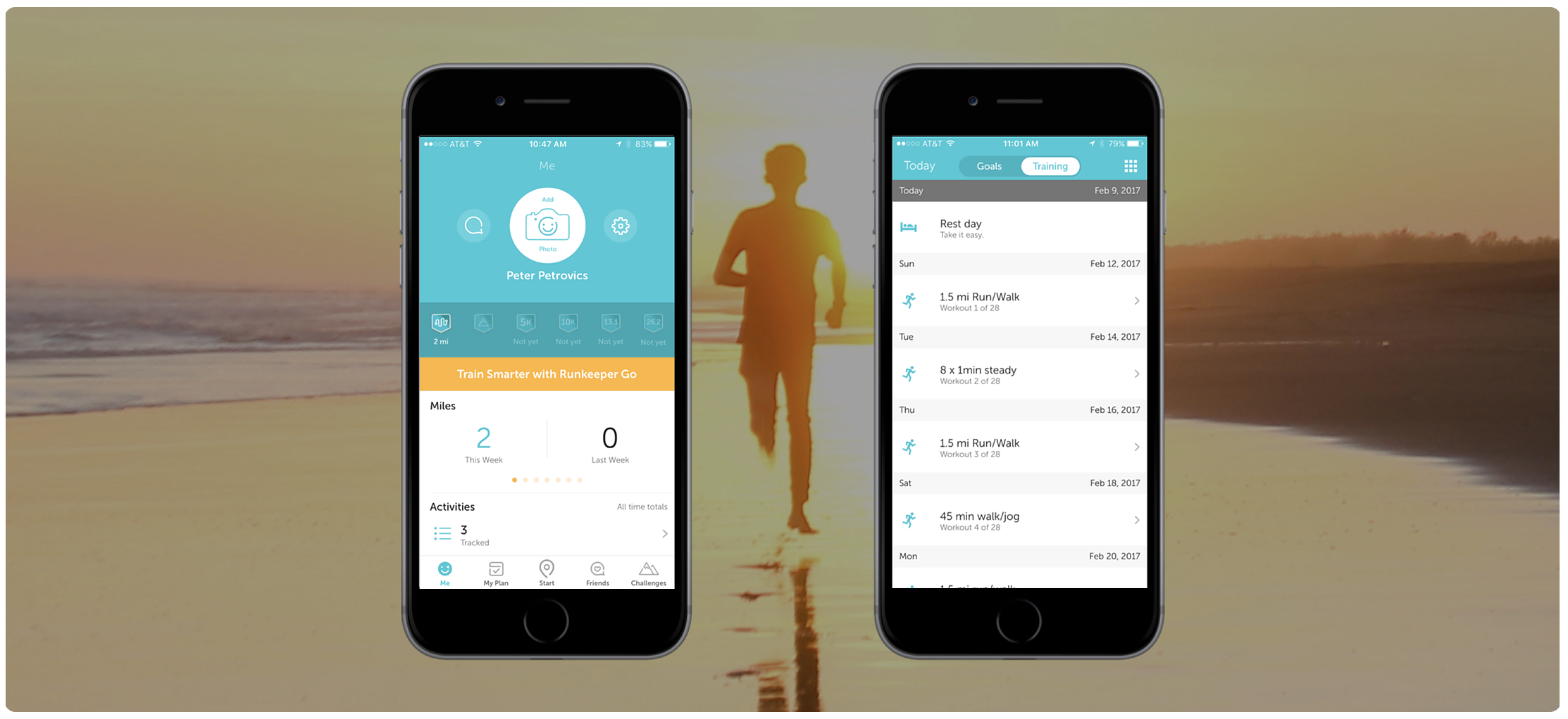
Runkeeper: A Usability Case Study
Objectives
- Analyze the app to brainstorm areas of friction for users
- Conduct usability tests to confirm pain points or uncover new ones
- Design a prototype to resolve major pain points
- Iterate until I can validate all design changes with data
Why Runkeeper?
Runkeeper is a GPS-enabled fitness tracking application that allows busy people to quickly set exercise goals and conquer them with friends. When I first started fiddling with the app, I was pleasantly surprised by how well-designed the user interface was. As a fitness enthusiast and product designer looking for a challenge, I decided to see if there was anything I could do to improve the user experience!
Results
The UI changes I implemented yielded the following results during usability testing:

Personas
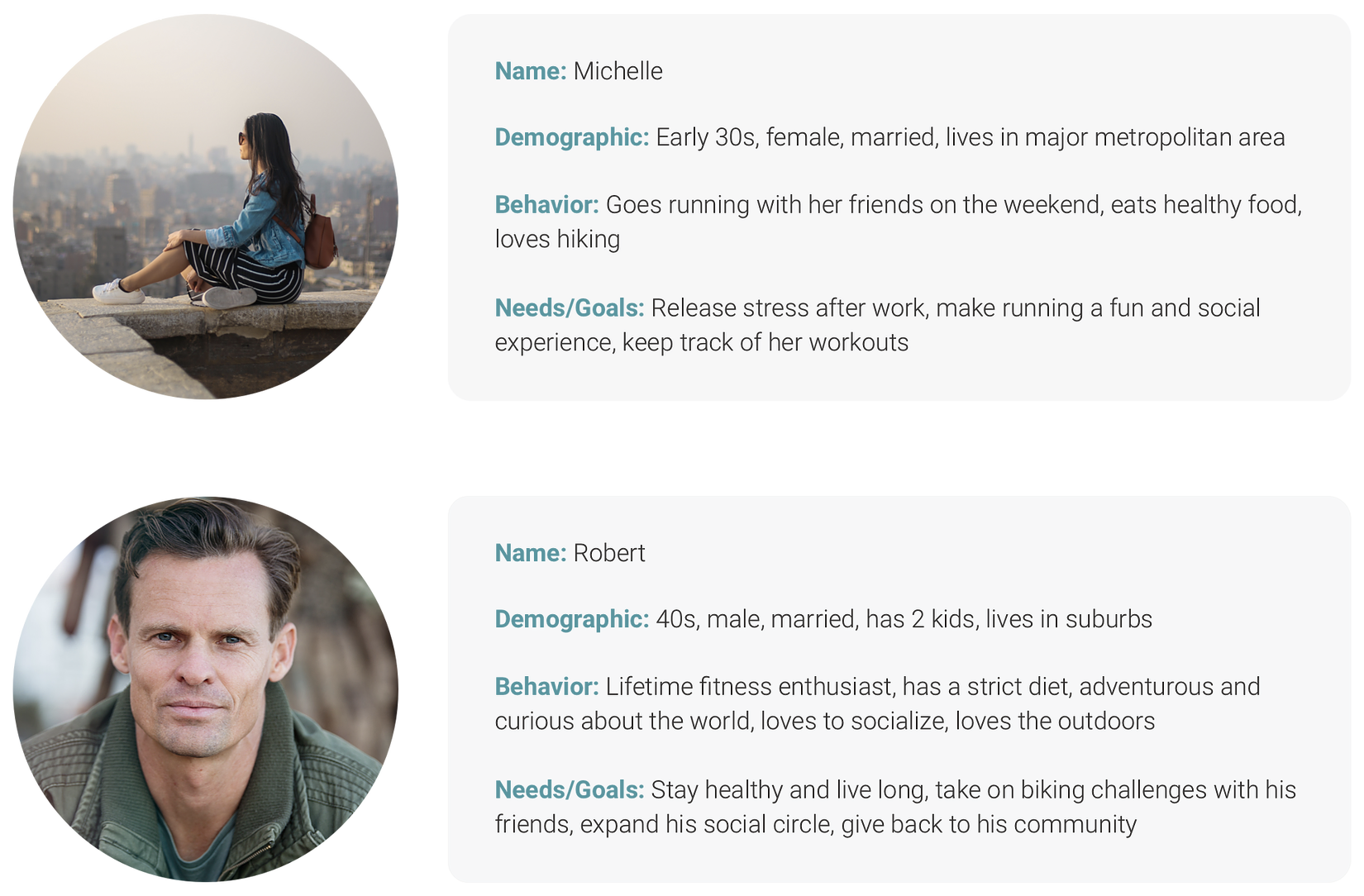
Before I could dive into usability testing, I needed to understand what kind of people are likely to use Runkeeper. This was my top priority because I knew that a solid understanding of the user base would help inform everything I do later in the design process. After conducting research on the company and reading testimonials from various users, I started putting together some provisional personas. I then further refined these personas by interviewing users about their hobbies, goals, and previous exposure to fitness apps:
Initial Observations
As I mentioned earlier, I had a very positive first impression of Runkeeper. The user interface achieves a clean, consistent look by sticking to a teal and orange color scheme with plenty of white space. In terms of information architecture, there are five distinct sections: summary, workout programs, start a workout, friends, and challenges.
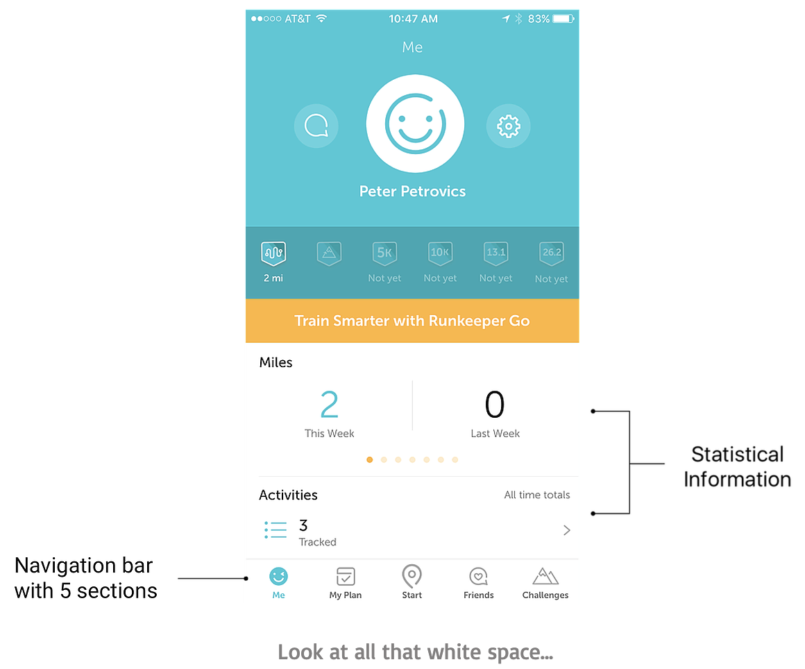
After digging a little deeper, I was able to uncover a few areas that I considered weaknesses. For example, it was a bit challenging to set up a goal and view my workout statistics. I also signed up for a training plan and felt a strong urge to quickly scroll through a list of the workouts. Unfortunately, there was no option to do so!
Usability Testing
Operating on these hunches, I set out to conduct guerrilla testing at Westfield Mall to discover whether or not these were true pain points.
These are the 3 separate tasks I had users complete:
1. Summer is coming and you want to look good on the beach. Create a goal to lose 10 pounds in 3 months.
2. Look up how many calories you burned on your 5K run last week.
3. You signed up for a training plan and want to quickly glance at your workouts for the coming weeks. Find the full schedule of your current 8-week training plan.
Affinity Mapping
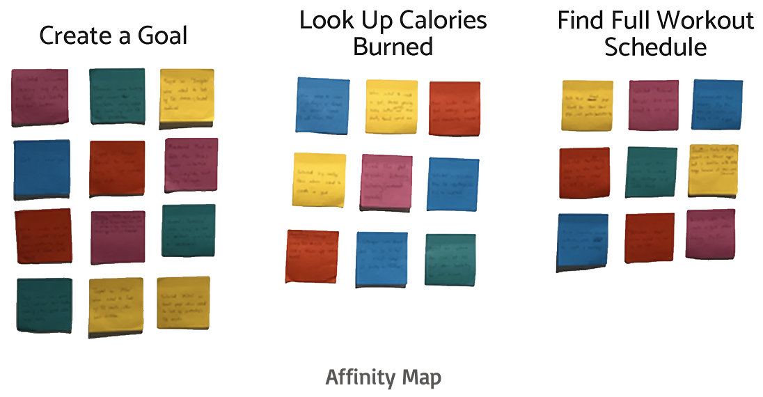
After usability testing, my goal was to analyze the data I collected and uncover the major pain points. I took videos of the way each user interacted with the app (with their permission of course) and collected a variety of observations on sticky notes. Next, I grouped together my insights to create an affinity map. This mapping is based on which task the user was performing, with different colors representing different users.
2x2 Matrix
I then made a rough prediction of the importance of each task to both Runkeeper and its users. In conjunction with affinity mapping, this exercise helped me determine which pain points to focus on. Note that these are assumptions that I strived to validate through company research and user interviews.
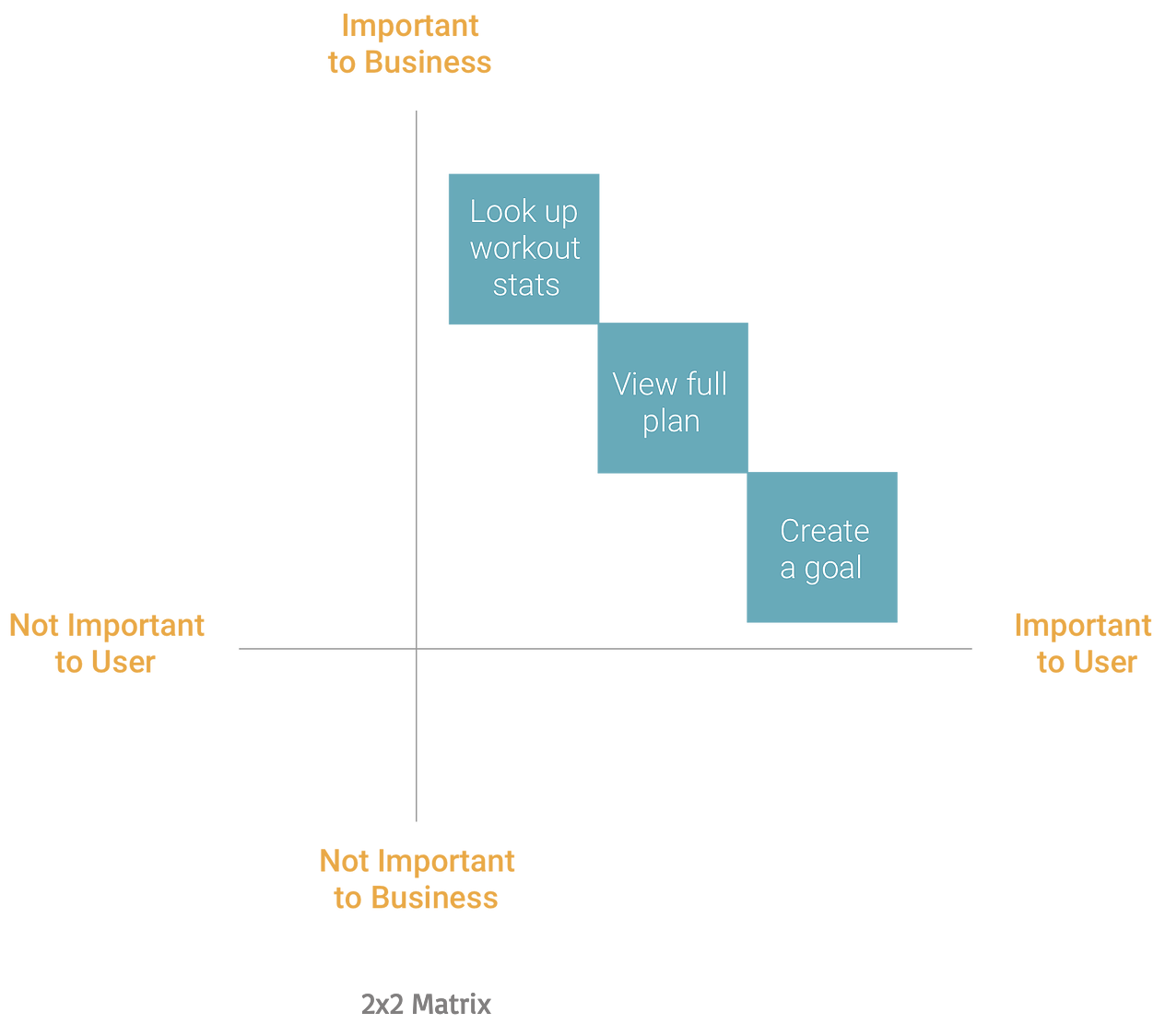
Runkeeper, like many other fitness apps on the market, generates revenue by providing users the option to purchase advanced training plans and stronger
analyses of their progress. Thus, I consider workout statistics and training schedules to be more critical for the business than the ability for a user to
create a goal.
For users, goal-setting is the most basic and essential feature to expect from a fitness app like Runkeeper. They want to create goals and
achieve them.
Pain Points
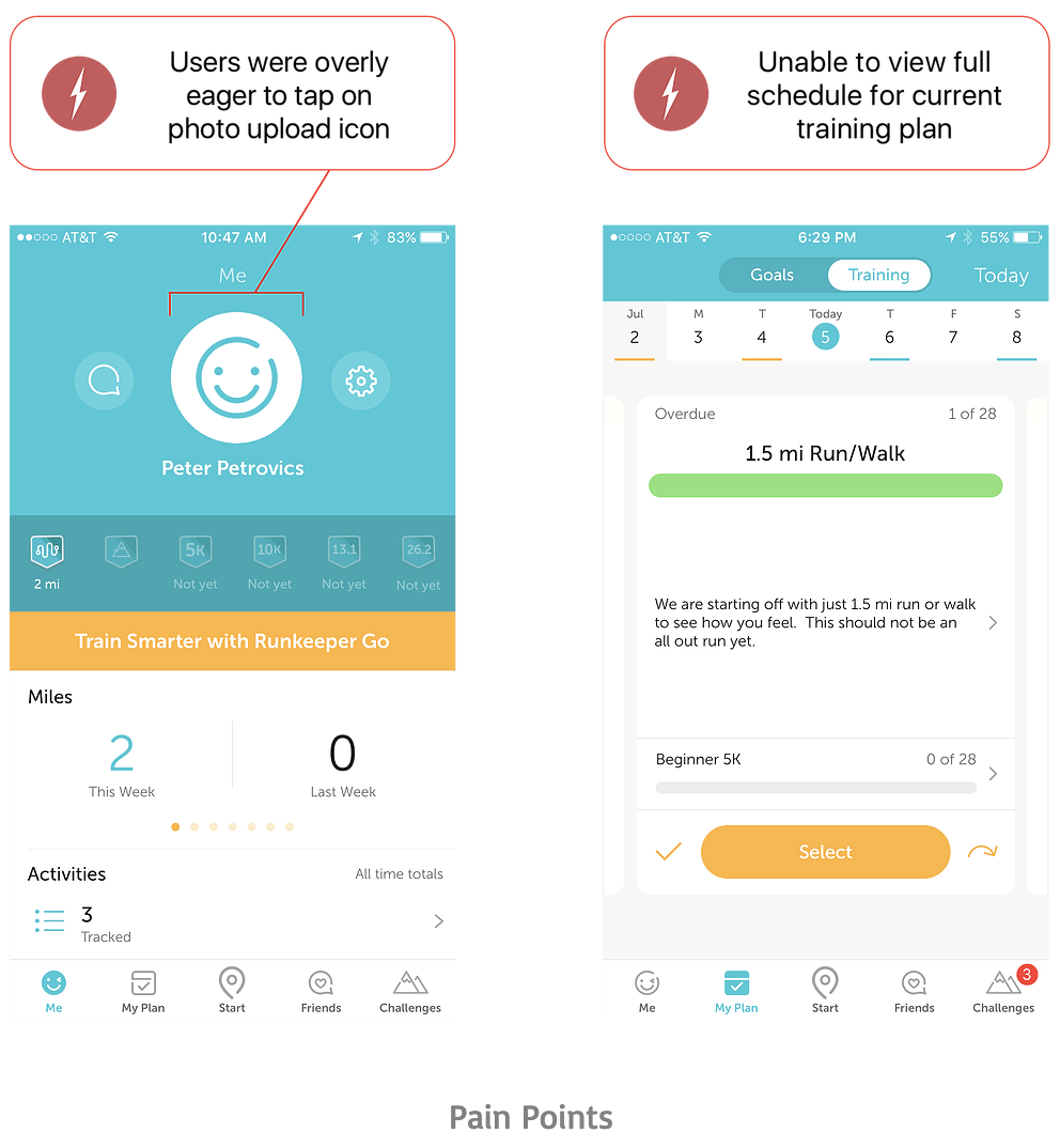
The affinity mapping and 2x2 matrix yielded some very interesting results! Here are the 2 main pain points that surfaced:
Findings and Prototypes
I discovered that the 1st pain point applied to all three tasks. For reference, here are the tasks I had users perform:

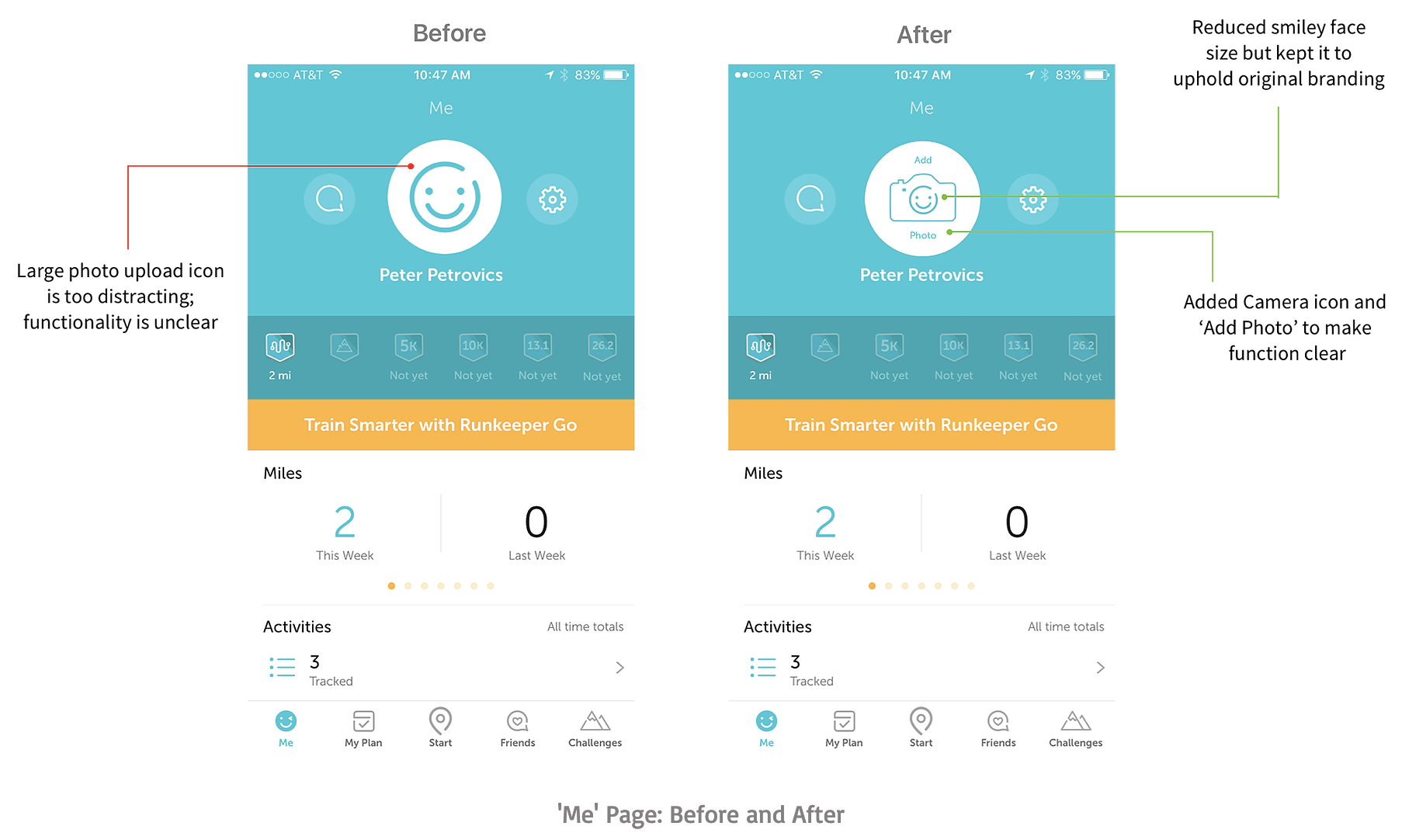
The only function of the photo upload icon is to choose a profile picture. However, it seems this was unclear to the vast majority of users. Out of the 5
people who initially interacted with the app, 4 ended up selecting the photo upload icon regardless of the task they were trying to accomplish.
If
you couple the icon’s large size with the fact that it’s a beautiful smiley face, it’s no wonder people fell into a trap!

I discovered that the 1st pain point applied to all three tasks. For reference, here are the tasks I had users perform:
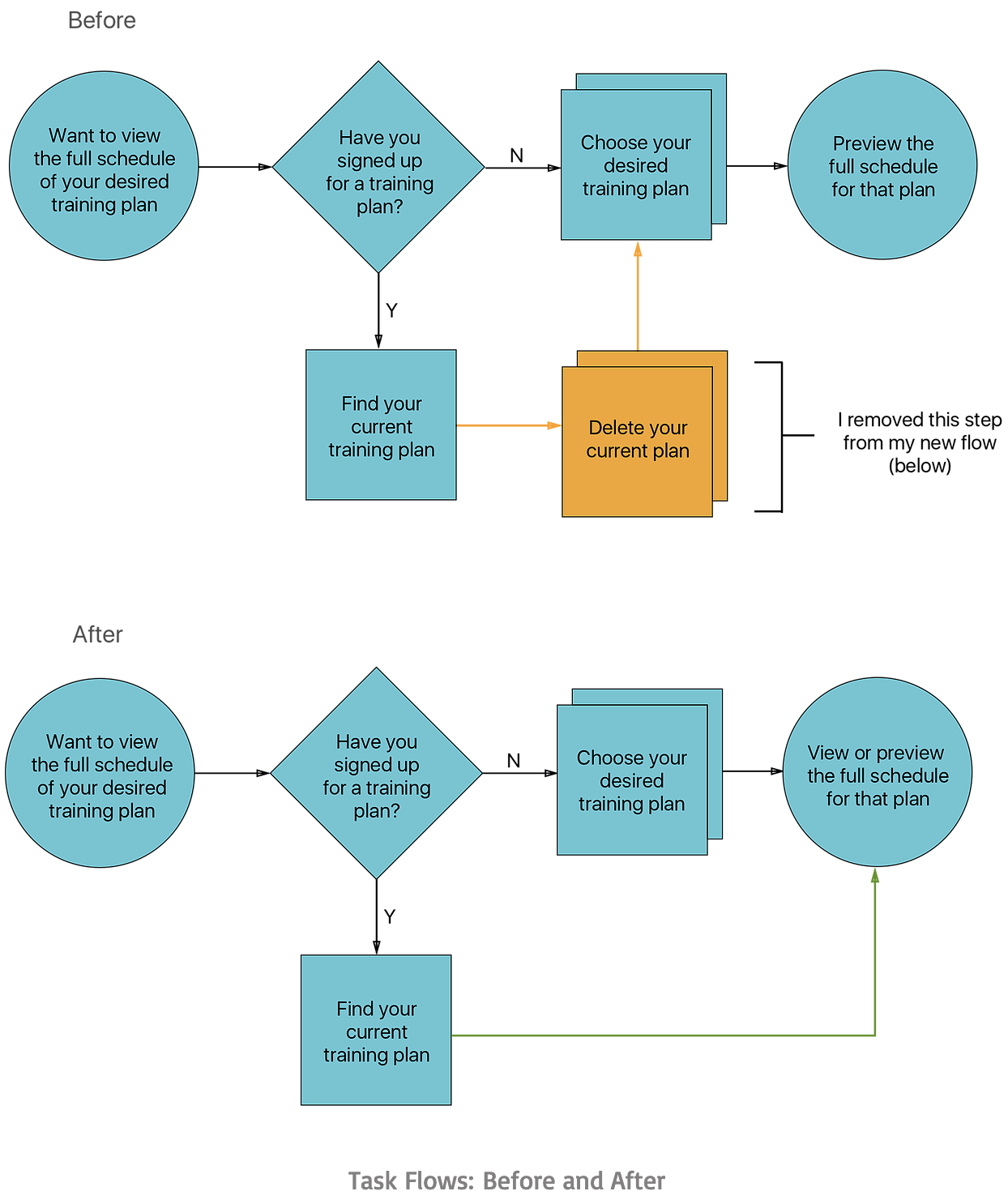
My third task was a doozie that revealed the 2nd pain point: it was impossible for users to view a listed workout schedule for a training plan they signed
up for without deleting the plan and previewing it.
When asked how important the ability to view a listed schedule was, every user made it clear that
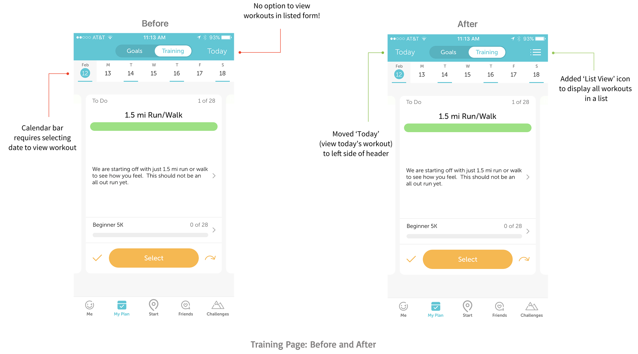
it was a necessity. This made it quite obvious that adding this feature would address their frustrations. Take a moment to compare the UI Flow before and
after I implemented my changes:
The two screens below show UI changes I made on the Training Page:
The screens below show the existing process a user would go through in order to preview their training schedule for a plan they haven’t signed up for yet. Note: I did not alter the UI for any of these screens.
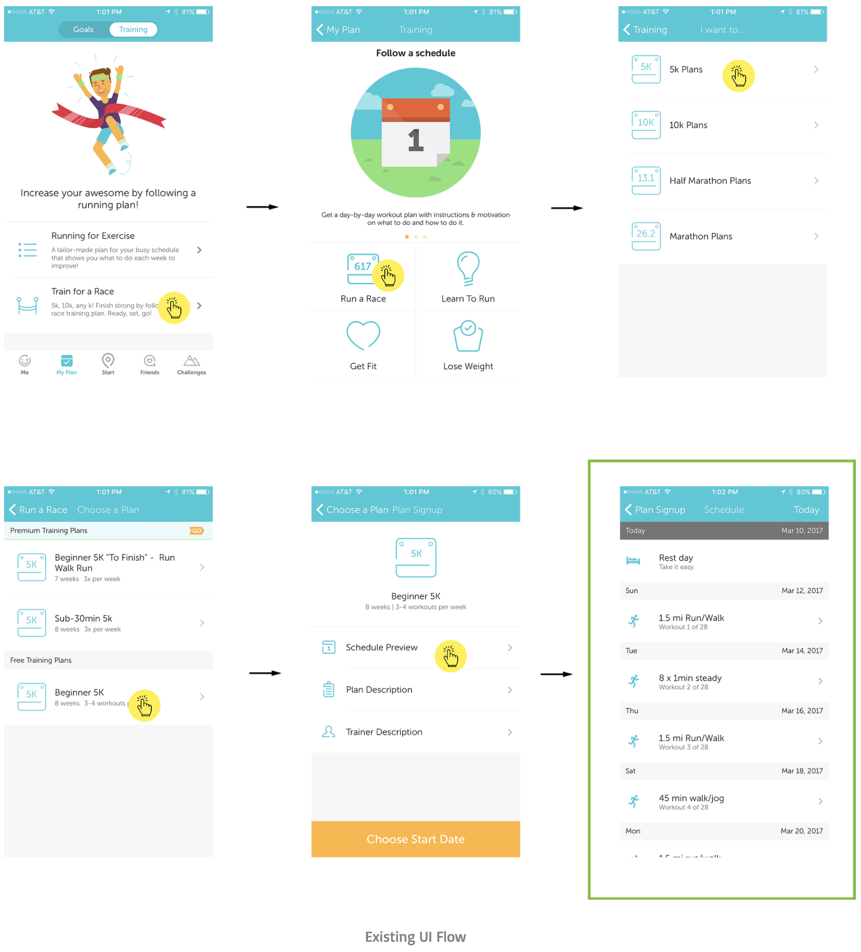
As you can see, the only way to view the full list of workouts is to preview a specific plan. Once you actually sign up for the plan, you’re no longer able to view that list (or preview it, for that matter)! To allow users to view a listed schedule for the plan they already signed up for, I created a separate flow:
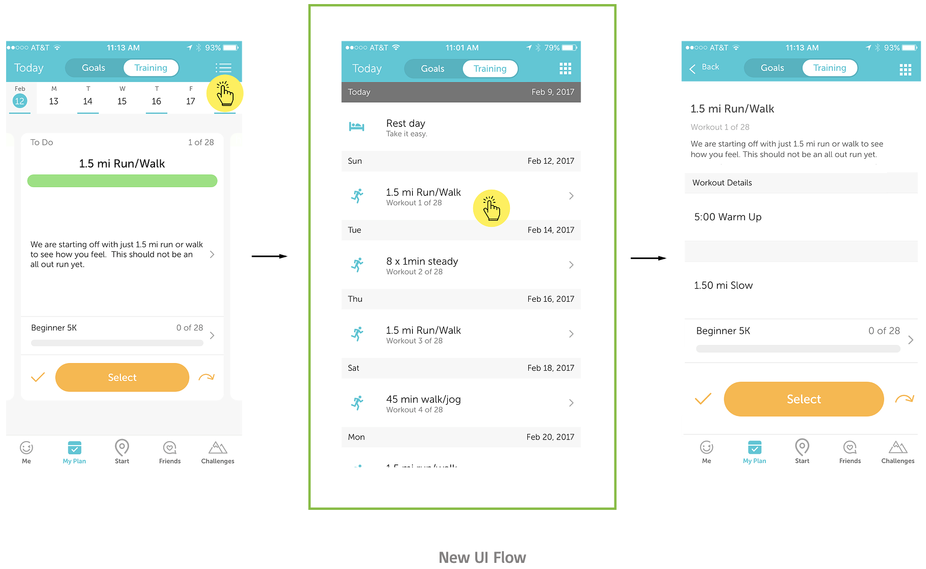
The second screen in this flow was previously only available as a preview before signing up for a plan. I added the third screen to show that you’d be able to take the same actions from the list view as you can from the card view (e.g. selecting or skipping a workout).
Validation and Conclusion
In order to confidently validate that my UI changes had a positive impact by eliminating the main user pain points, I needed to compare the results of
initial usability testing to the results of my final round of testing.
Note that I am omitting all other rounds of iteration and just focusing on
the start-to-end deltas. First, let’s look at the number of people during initial guerilla testing who were able to accomplish each task within 20 seconds:
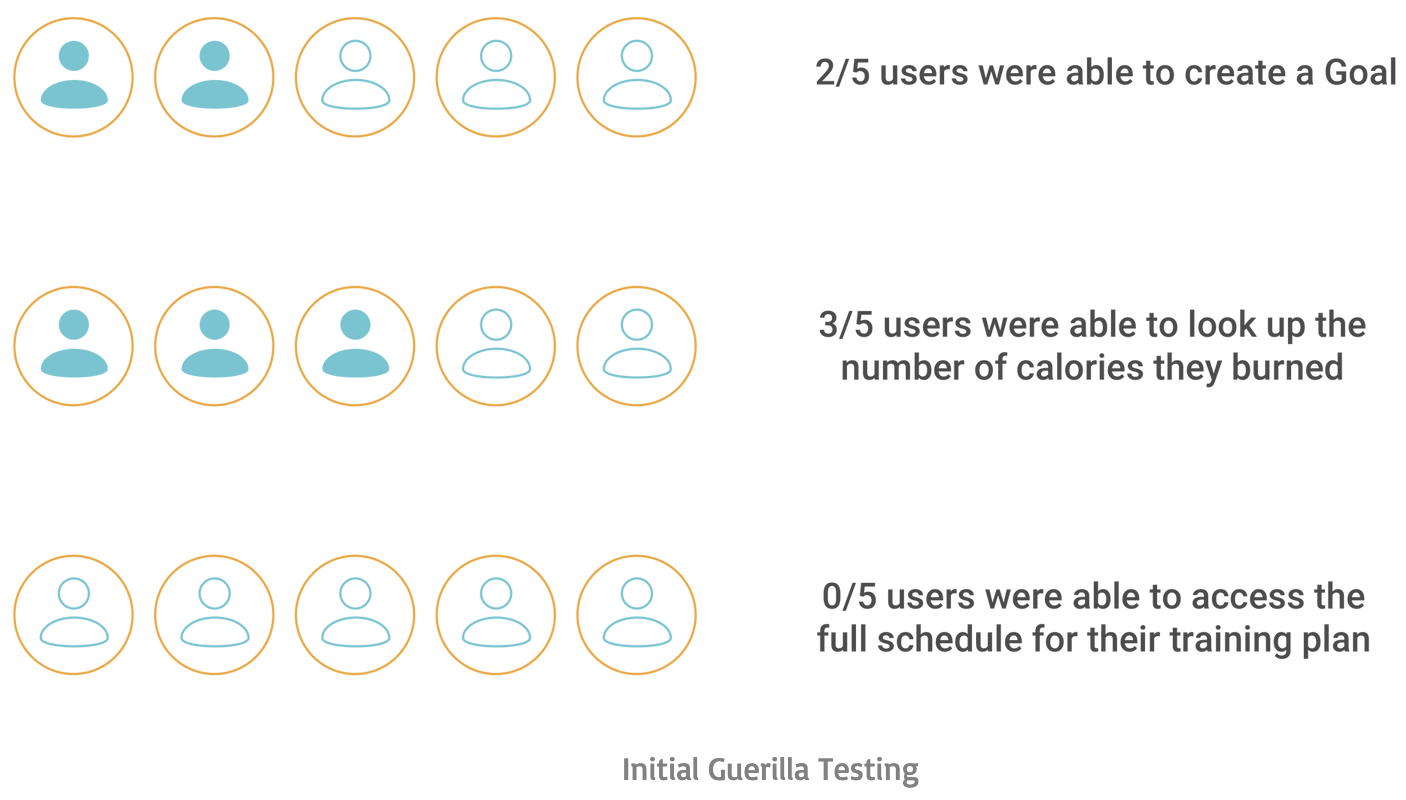
Now let’s look at how these results changed during the final round of user validation, where new users were again given 20 seconds per task:
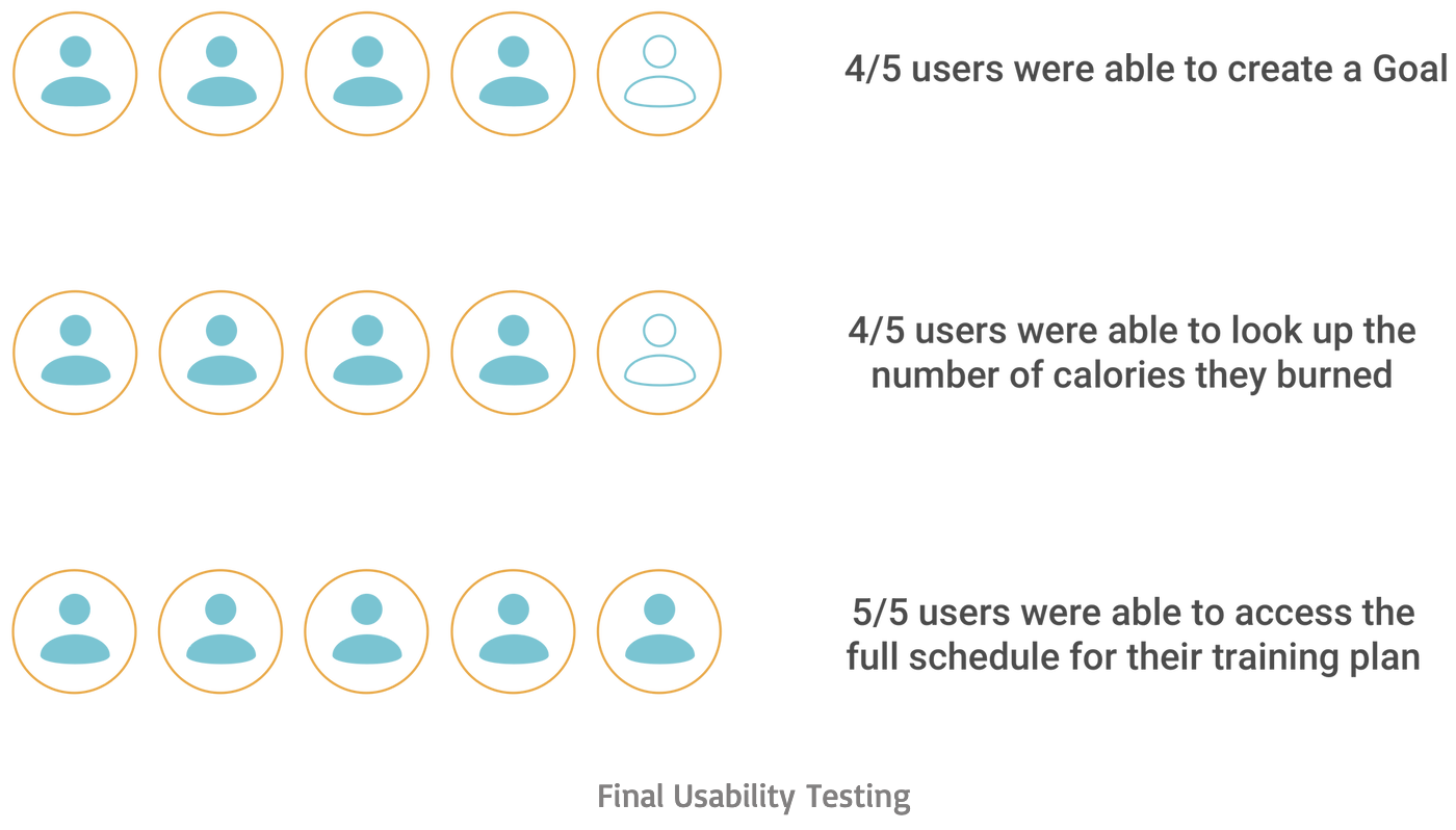
Finally, I noted the number of people who did not mistakenly select the photo upload icon:
I was pleased to see that creating a camera icon and including ‘Add Photo’ clarified the photo uploader’s functionality while creating less of a distraction
for users. As for the full schedule, everyone was able to find what they were looking for and confirmed their desire to keep this feature.
I received a few
comments about the possibility of presenting a user’s training plan using a series of collapsible drop-downs inside the calendar page. This would allow users
to look up all training sessions arranged by week and would present the information in a neat, interactive way. It’s an interesting solution and I look
forward to investigating it further!
Here’s the interactive prototype I used to validate my design solutions: